Limitly - designing a better way to manage personal finances

Summary
At Swachh AI, I led the onboarding experience for Limitly — the make-or-break moment where users either commit or leave. Through user interviews, drop-off analysis, and archetype-based flow testing, I arrived at an interface that significantly improved onboarding completion rates.
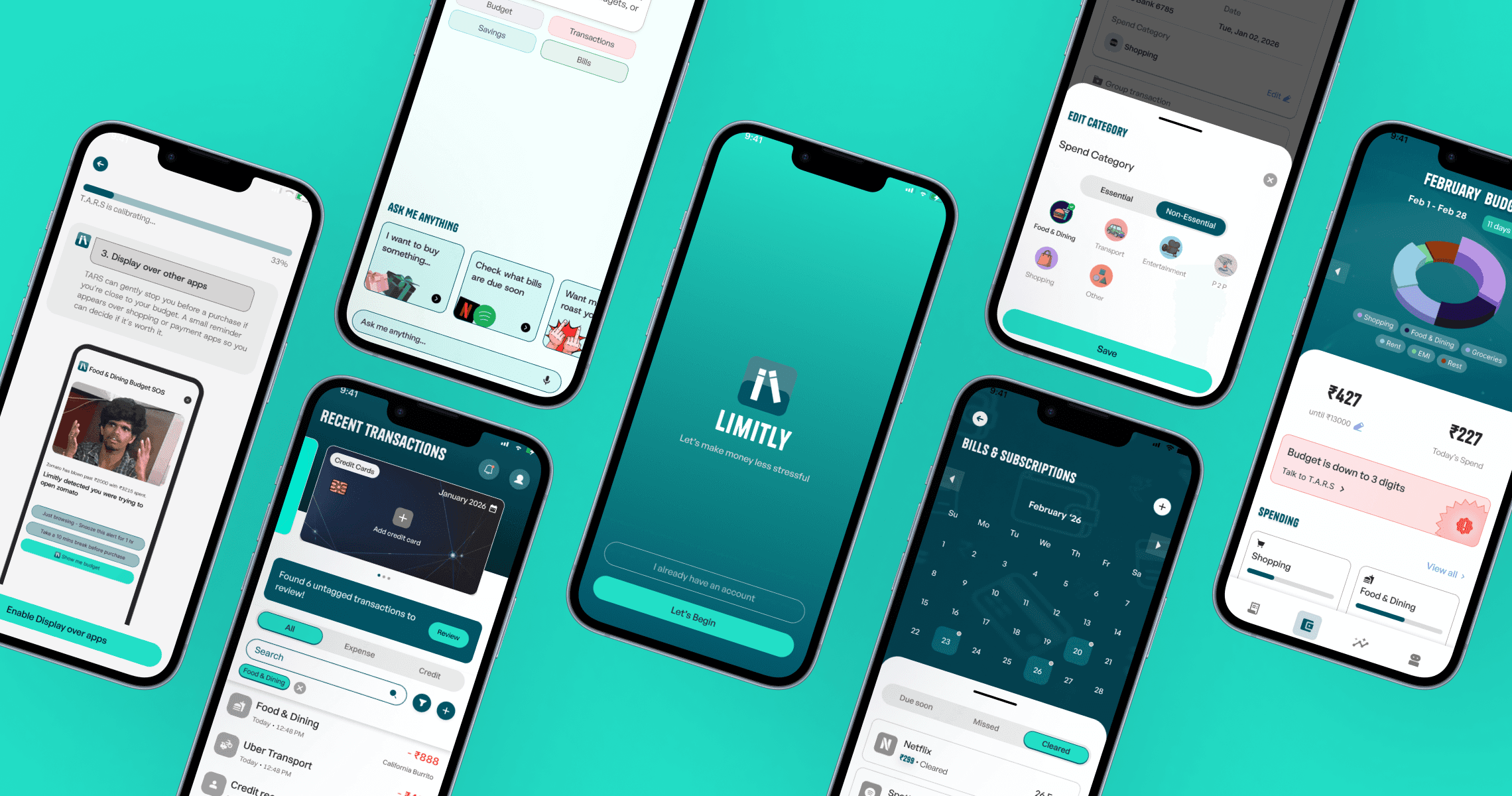
Onboarding redesign with an empathetic hook, transparent data policy, and a personalised T.A.R.S. setup flow
Transactions interface with monthly totals, category filtering, recurring controls, and split payments
Budgeting reframed as visual planning with donut charts, progress bars, and a savings stack
Conversational agent that flagged specific moments and prompted real-time action
The context
What is Limitly?
Who is it for?
Students (18-24)
Students building money habits
Learning to budget save, and grow
Early Professionals
Starting careers & managing income
Self-Employed/Buisness owners
Managing multiple or project based income
Tracking multiple cash flows & staying in control
Why?
Most finance apps assume you're already organised. Limitly was built for the people who aren't. Give them a system that works quietly in the background so staying on top of money doesn't require discipline every single day.
how it began.


so what was the problem?
Friction points in the current app

Forced Onboarding
Questioning legitimacy
Privacy concerns
Info dump on user
No guidance
Trust is a scary thing in Fintech, you can't be pushy.
1
Unclear Value proposition
Users are asked to sign up before the product has said anything about why it should matter to them
2
High cognitive load
New users are forced to make multiple decisions (budget limits, categories, tracking method) before they've seen their own data
3
Insights lack clarity
Too many signals surfaced at once; users can't tell what needs attention right now
4
Blind trust expected
The app requests permissions and data access without earning the moment
Alright, lets dive deeper
What are the people saying?

User pain points
Scattered Transactions
Untracked & forgotten subscriptions
manual logging is a hassle & boring
Cannot control overspending.
Validating problems people were facing
Emotions in the background
Retention reality
73%
abandon apps during onboarding due to design problems alone
SaaS Factor, 2024
39%
would delete a finance app after a single security issue
EY, cited in Contentworks, 2024
10–15%
Day 7 retention rate, regardless of motivation in all sectors
ContextSDK, 2024
Studying the tried and tested
Feature comparison matrix
Limitly vs all 4 competitors across their feature listings
Not Available
Implemented
Partially Implemented / Similar Approach
Actionable insights
#Priority 1
Value first Friction later
Replace enforcement with understanding
#Priority 2
Make money grow while it sits
Turn money management into a challenge
Borrow Duolingo's streak and challenge mechanics to build daily financial habits. Weekly spend challenges, no-spend streaks, and category goals. Completing them feels rewarding, not disciplinary.
What we did
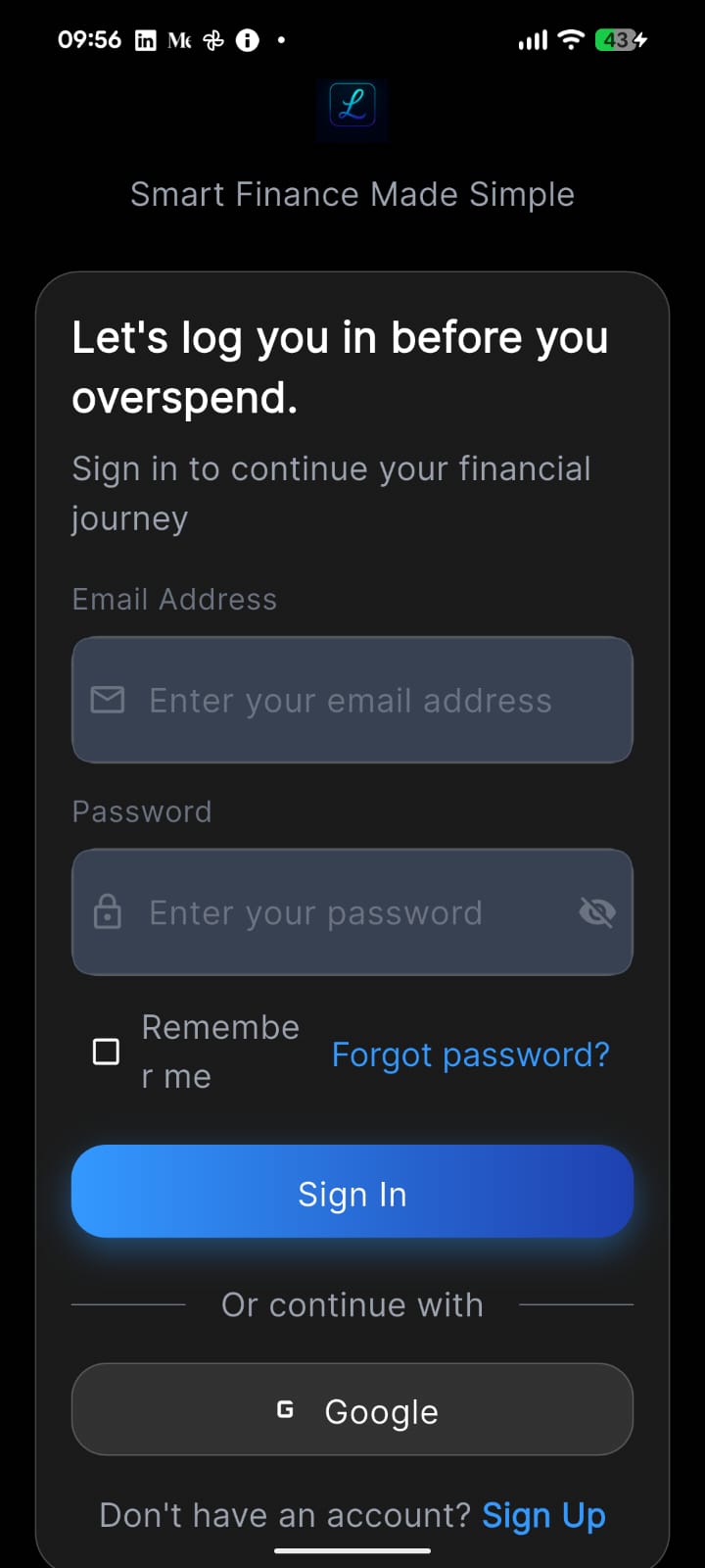
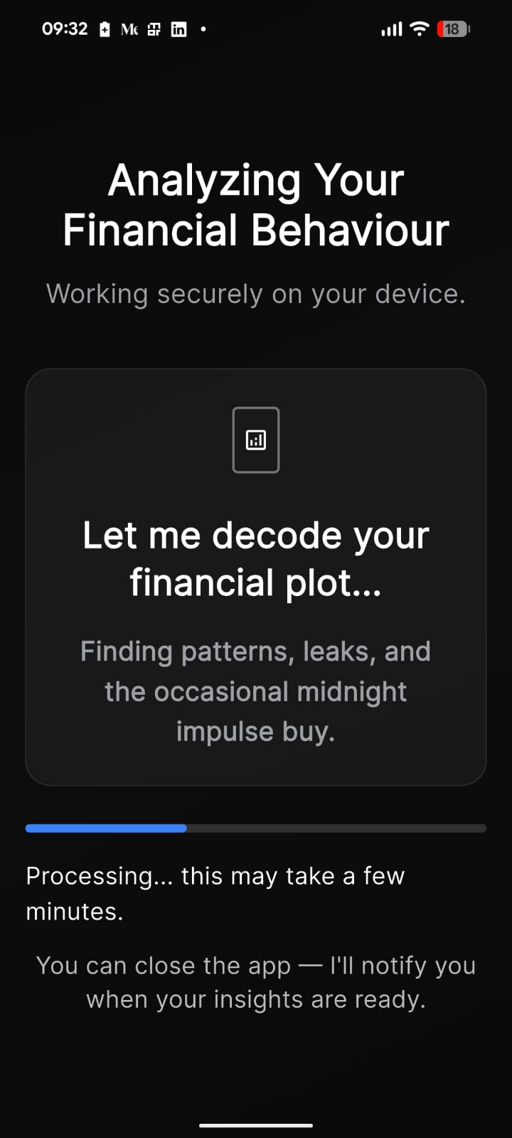
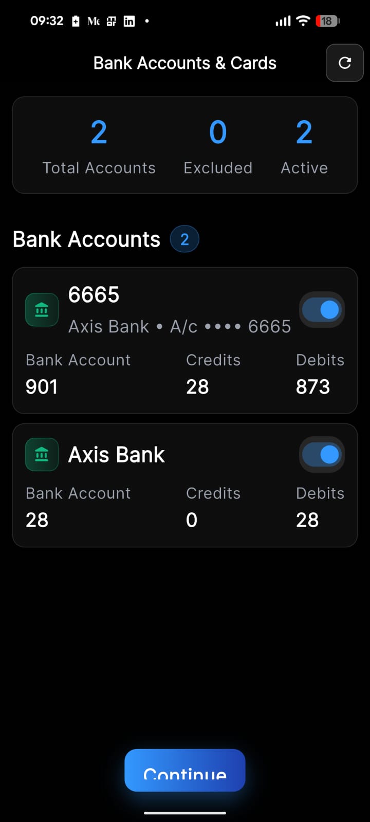
New onboarding
Solved for Value before asking for trust
User convection through personlisation
Low cognitive load
Feature sorting
Scrapping home page
Clarity among feature sets
Strategically integrating insights across relevant sections
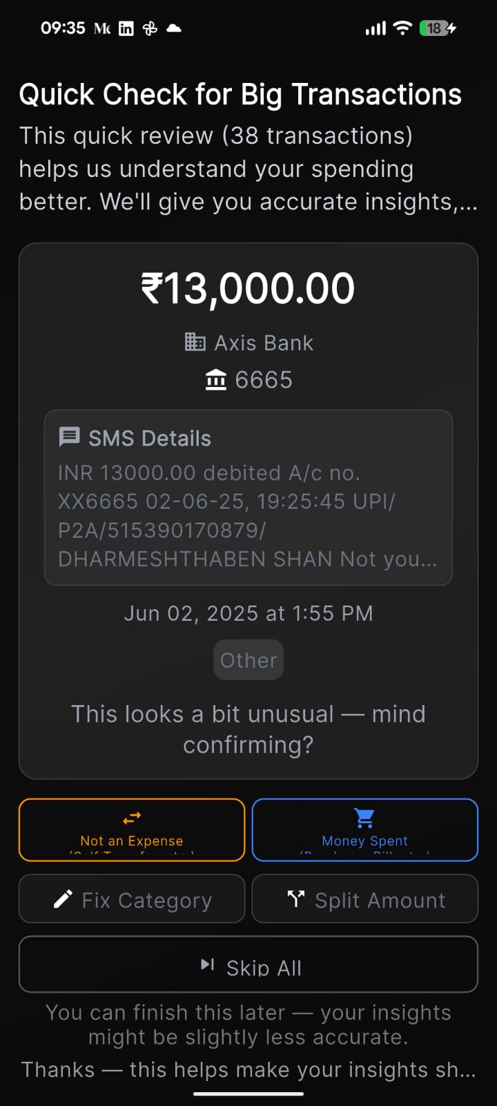
Transactions & reviews
Users no longer had to dig through budgets to find miscategorized transactions. They could catch what the system missed, without going looking for it. So gaps between check-ins never snowballed into bigger errors.
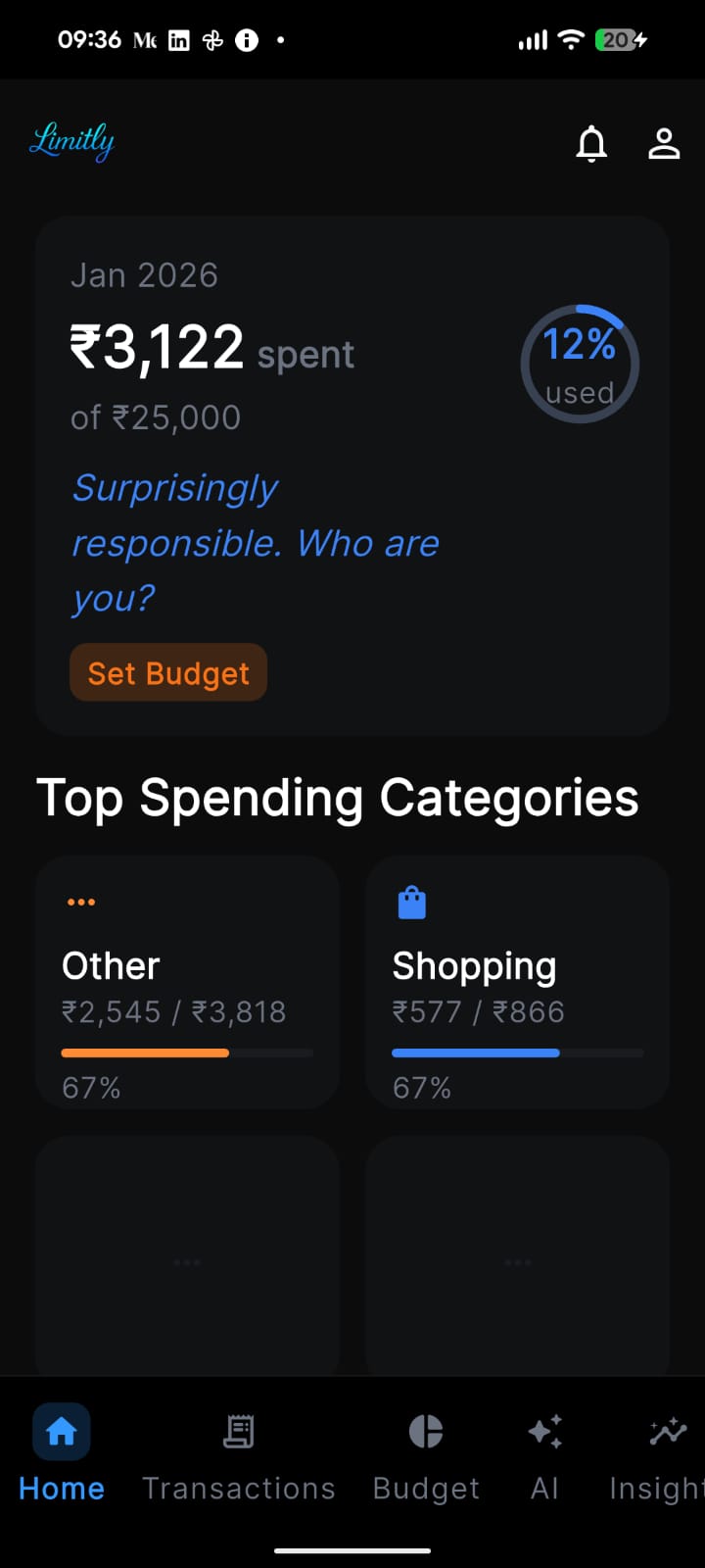
Automated budgets
Solving for: Cannot control overspending.
Solving for: manual logging is a hassle & boring
SMS transactions auto-read and sorted into categories
Budget limits set from your spending patterns (adjustable)
No manual input needed to get started.
Bills & Subscriptions
Solving for: Untracked & forgotten subscriptions
Due date alerts before the deduction hits
Adding bills on marked dates
Splitting expenses & groups
Add friends via contacts or email
Split any transaction across the group
Tracks balances and sends reminders automatically
Splitting an expense
Adding a Friend
When user tries to leave group without settling splits
Great, now lets test it
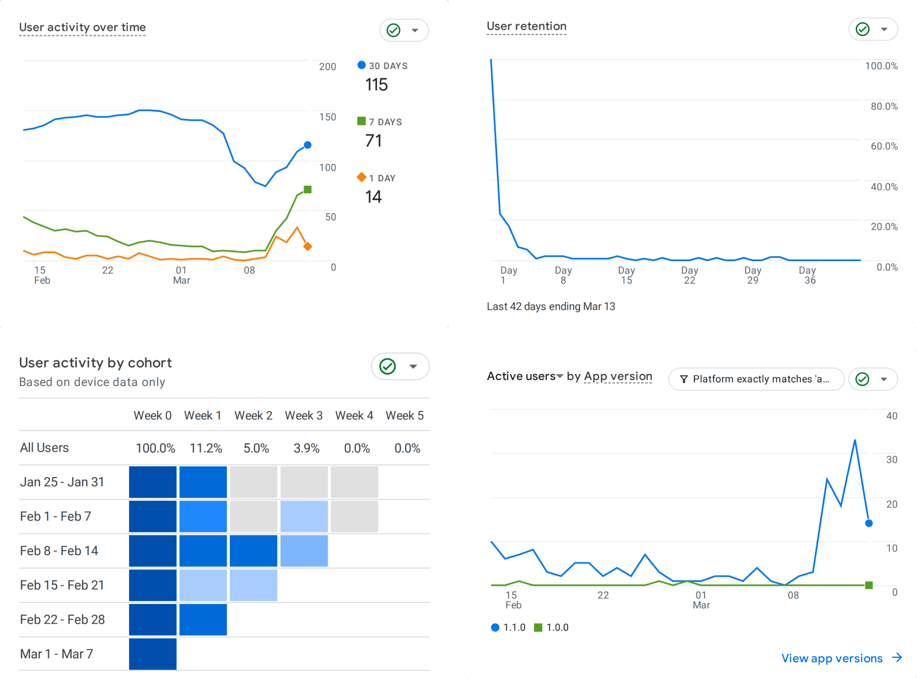
Results of user testing
Cool, so what's next?
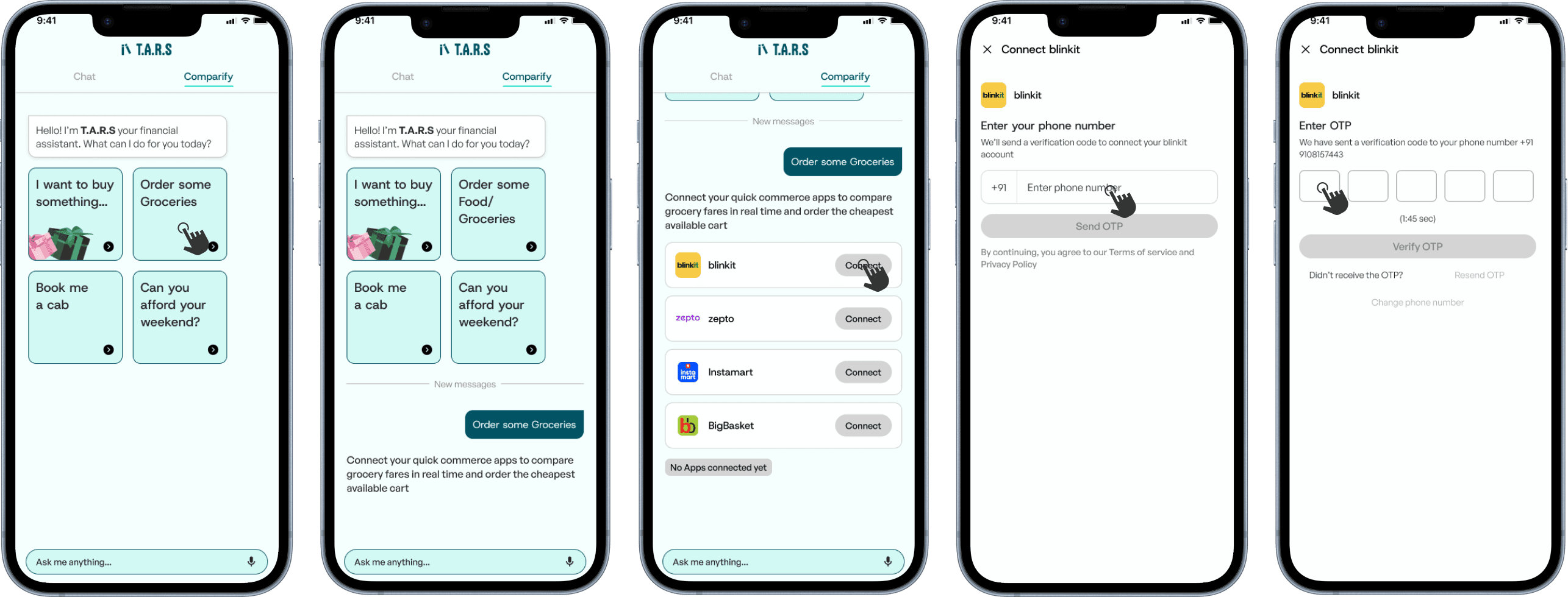
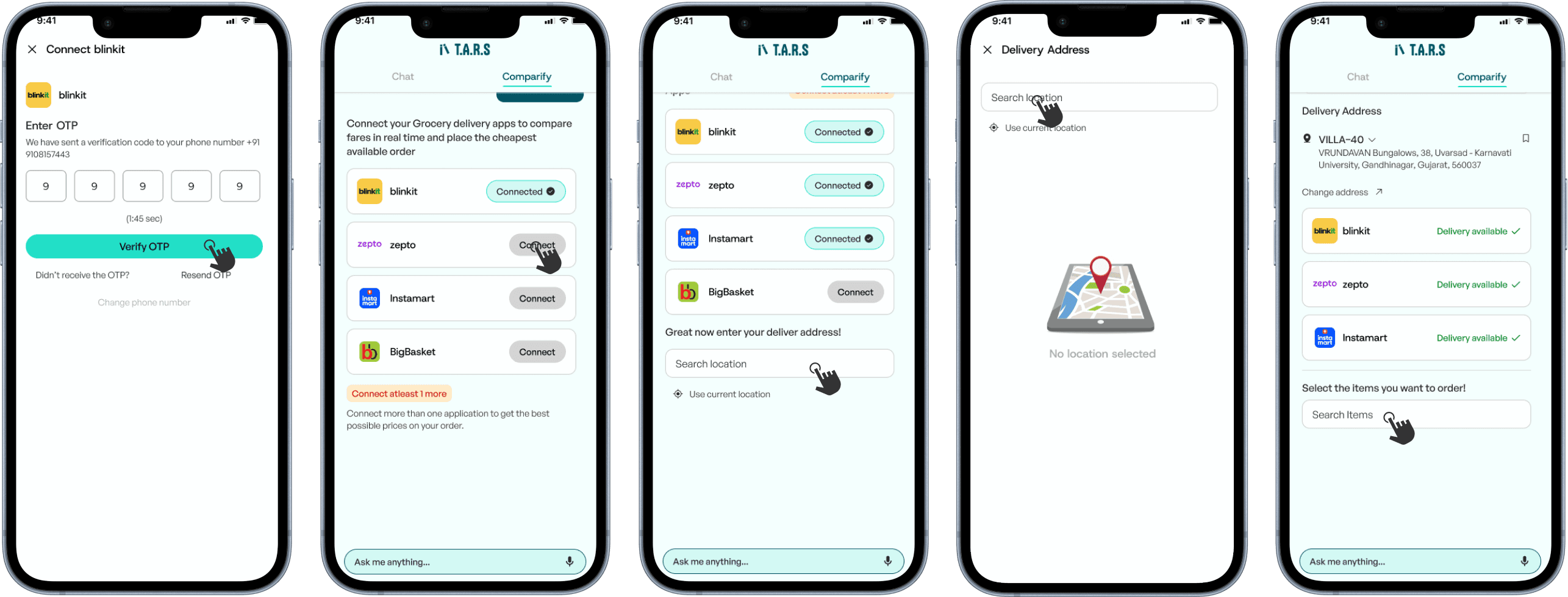
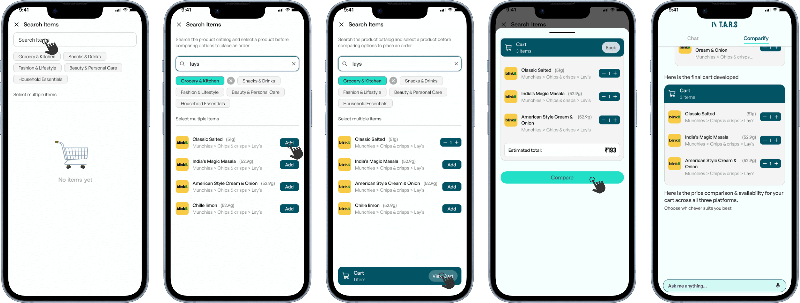
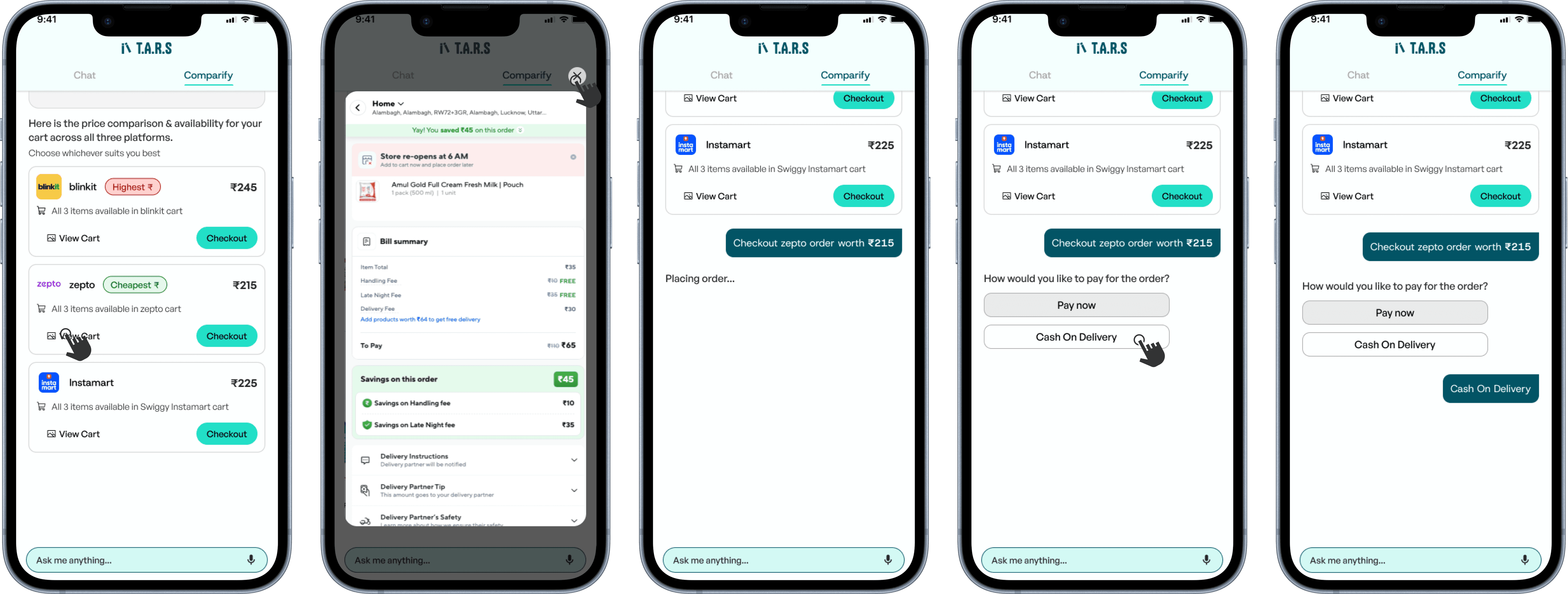
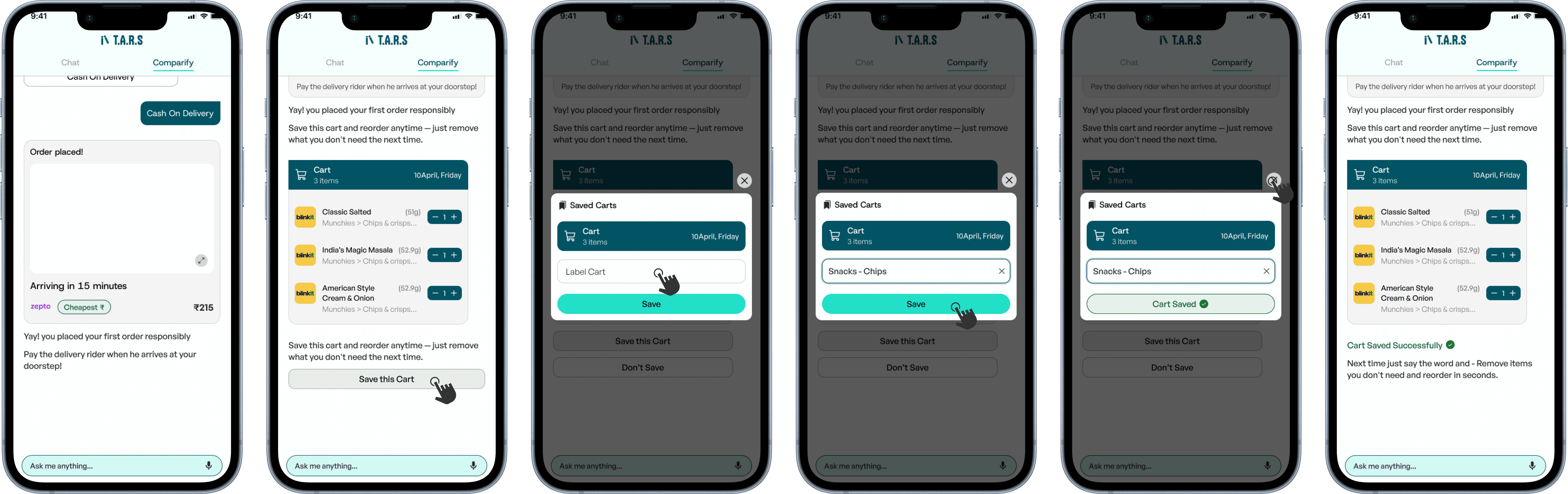
Agentic T.A.R.S - Exploration
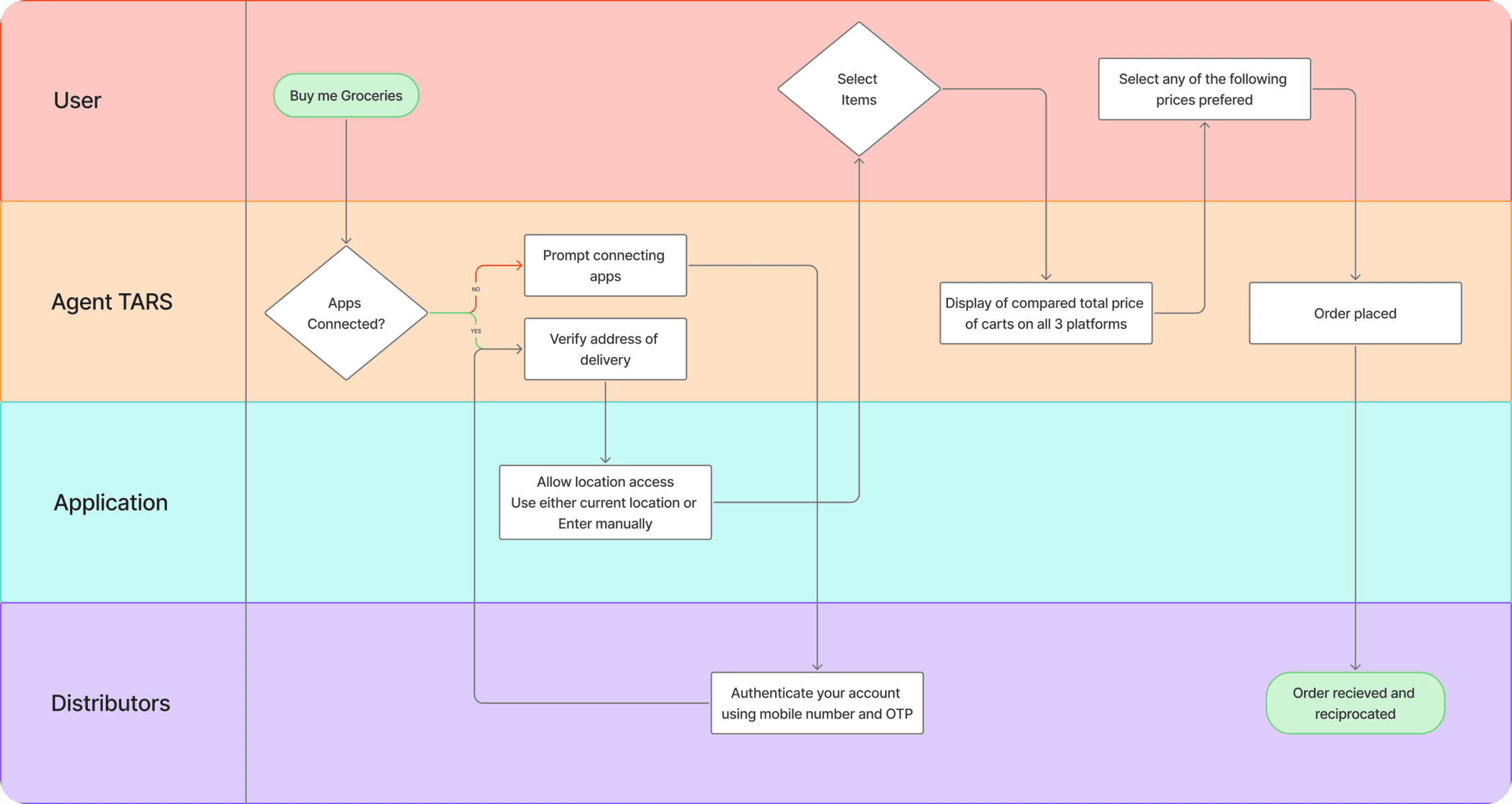
Agentic T.A.R.S
What stayed with me
Results
Introduced a new onboarding framework that helped improve onboarding completion and strengthen Day 0 engagement, with average first-session time reaching 727 seconds.
Key learnings
Understood the importance of simplifying flows without removing functionality through AI
Developed prioritization skills when working with a time contraints.