
Summary
Key tasks performed
Skip to design
The context
What is Limitly?
Who is it for?
Students (18-24)
Students building money habits
Learning to budget save, and grow
Early Professionals
Starting careers & managing income
Building financial stability & savings
Self-Employed/Buisness owners
Managing multiple or project based income
Tracking multiple cash flows & staying in control
So, whats the problem?


1
Value proposition not instantly clear
2
High cognitive load in early onboarding
3
Insights lack clear priority
4
Trust is asked for but remains unexplained


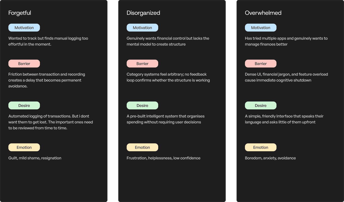
Audience
Stated friction
Core JTBD blockers
Alright, time for some research
What are the people saying?
Identifying proof from secondary sources to validate the problems people were facing
Emotions in the background
Retention reality
46%
of Gen Z feel confident about managing their own finances
CoinLaw, 2025
73%
abandon apps during onboarding due to design problems alone
SaaS Factor, 2024
68%
of Gen Z identify money stress as their top mental health concern
Bank of America, 2024
39%
would delete a finance app after a single security issue
EY, cited in Contentworks, 2024
10–15%
Day 7 retention rate — regardless of motivation in all sectors
ContextSDK, 2024
Okay, lets try and fix that
Before designing a solution it was worth understanding what had already been tried and where there was genuine room to improve.
Cleo

Users: 8M+ users (2025)
Market: United States only
Audience: Gen Z, paycheck-to-paycheck workers, (18–30)
Cleo proved that tone is a product decision, not a copywriting one. By replacing clinical financial language with a conversational, occasionally irreverent voice, Cleo made a category that typically triggers anxiety feel approachable — even on a bad spending day. Users did not feel judged. They felt talked to.
Fold

Users: 600K+ (Nasdaq-listed FLD, 2025)
Market: -
Audience: Crypto-curious spenders, (20–35), BTC enthusiasts
Fold proved that structure is the product. By building automatic expense categorisation from day one, users never had to organise anything themselves — the system existed before they arrived. Fold showed that the biggest drop-off trigger isn't complexity. It's the blank page. Give people a starting point, and they stay.
Revolut India

Users: 50M+ globally, 40M+ active (2025)
Market: UK, EU, US, expanding APAC
Audience: 25–40, frequent travellers, multi-currency
Revolut proved that the moment of spending is the moment to intervene. Instant notifications and smart budgeting tools meant users never had to manually log a thing. The app already knew. Revolut showed that frictionless financial visibility is a baseline, not a premium. Awareness without effort is the real product.
Curie money UPI

Users: ~1L downloads, beta until Oct 2025
Market: India only (Bengaluru-based)
Audience: Salaried Indians seeking yield on idle cash
Curie Money proved that your money should work even when you don't. By parking balances in liquid mutual funds with a 6.7% interest annually, while keeping them ready for instant UPI payments. Users changed nothing about their behaviour. Passive growth is the retention hook.
Feature comparison matrix
Limitly vs all 4 competitors across their feature listings
Not Available
Implemented
Partially Implemented / Similar Approach

Opportunity areas
Show value before asking for anything
Replace enforcement with understanding
Make money grow while it sits
Turn money management into a challenge
Okay now how do we go about implementing this?
01
Using research findings to inform design
02
Test and validate design decisions
03
Refine & iterate
Alright, lets Design
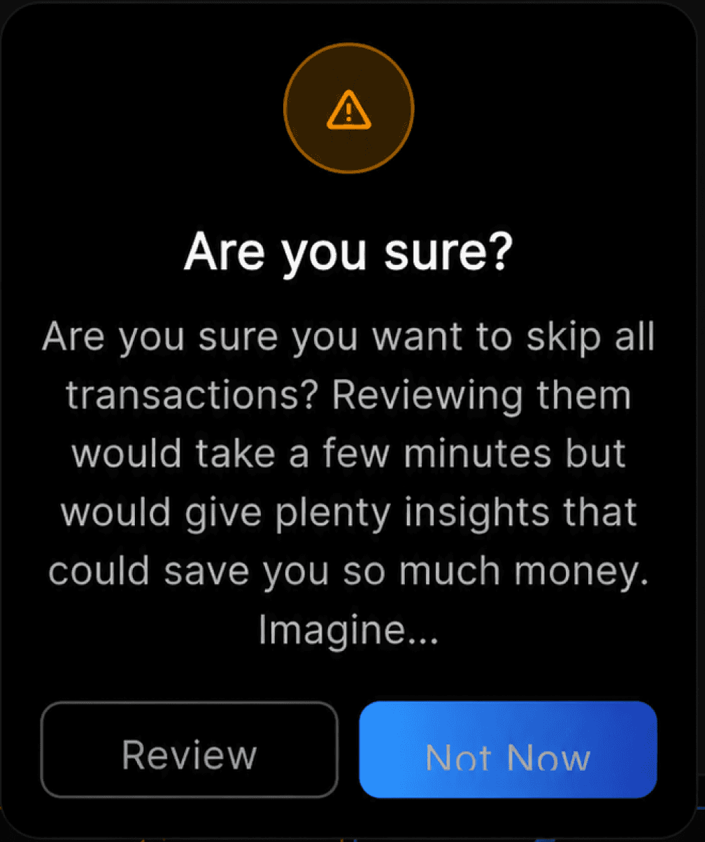
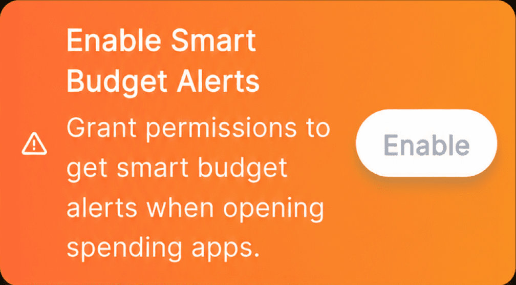
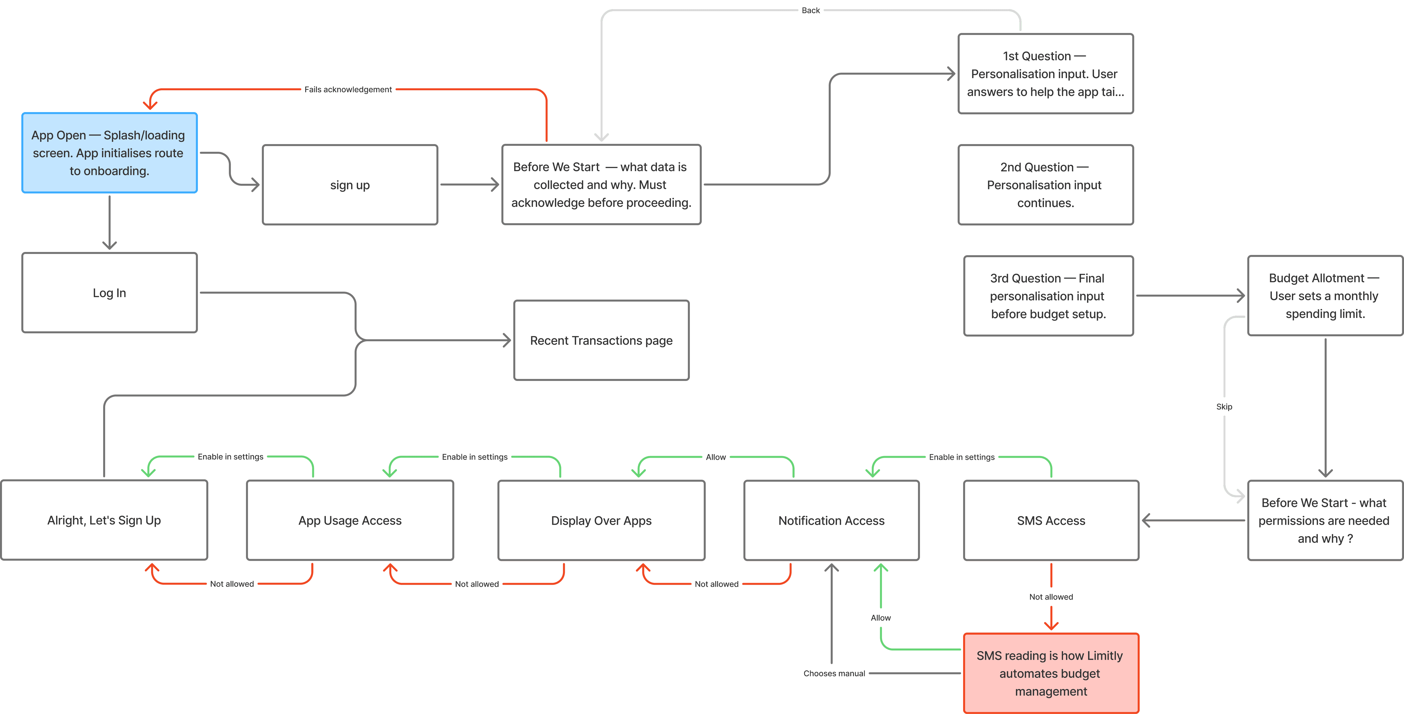
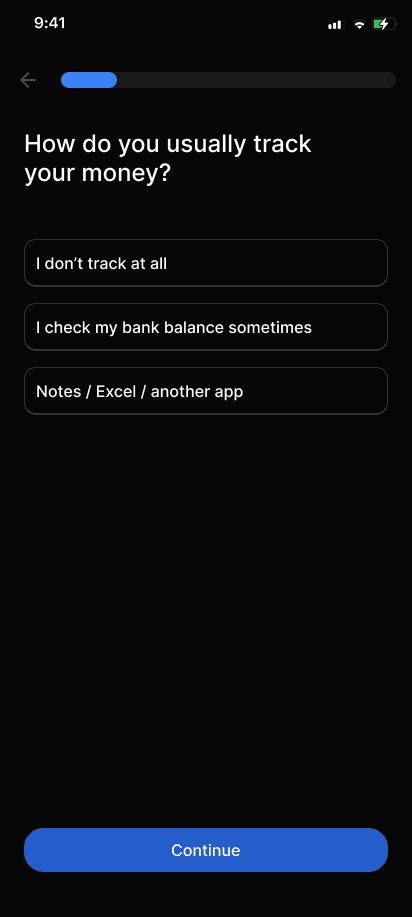
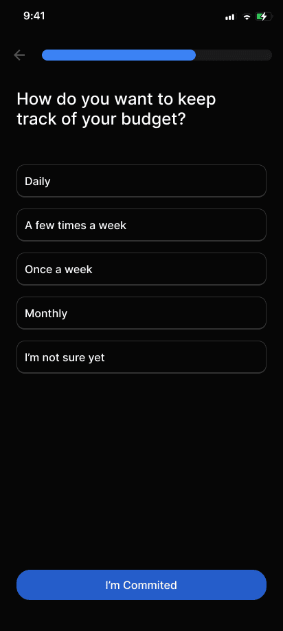
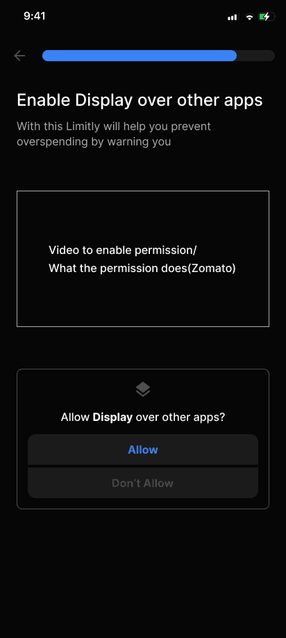
One of the biggest challenges was the onboarding flow, becuase there wasn't one to begin with
Inititially users were pushed to:
sign up—give permissions—review transactions—home screen
before they understood what the features are and how they were
adding value.

Trust is a scary thing in Fintech, you can't be pushy.
Speed was key.
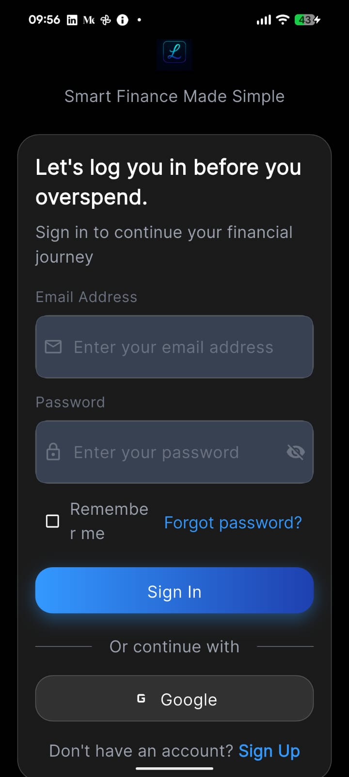
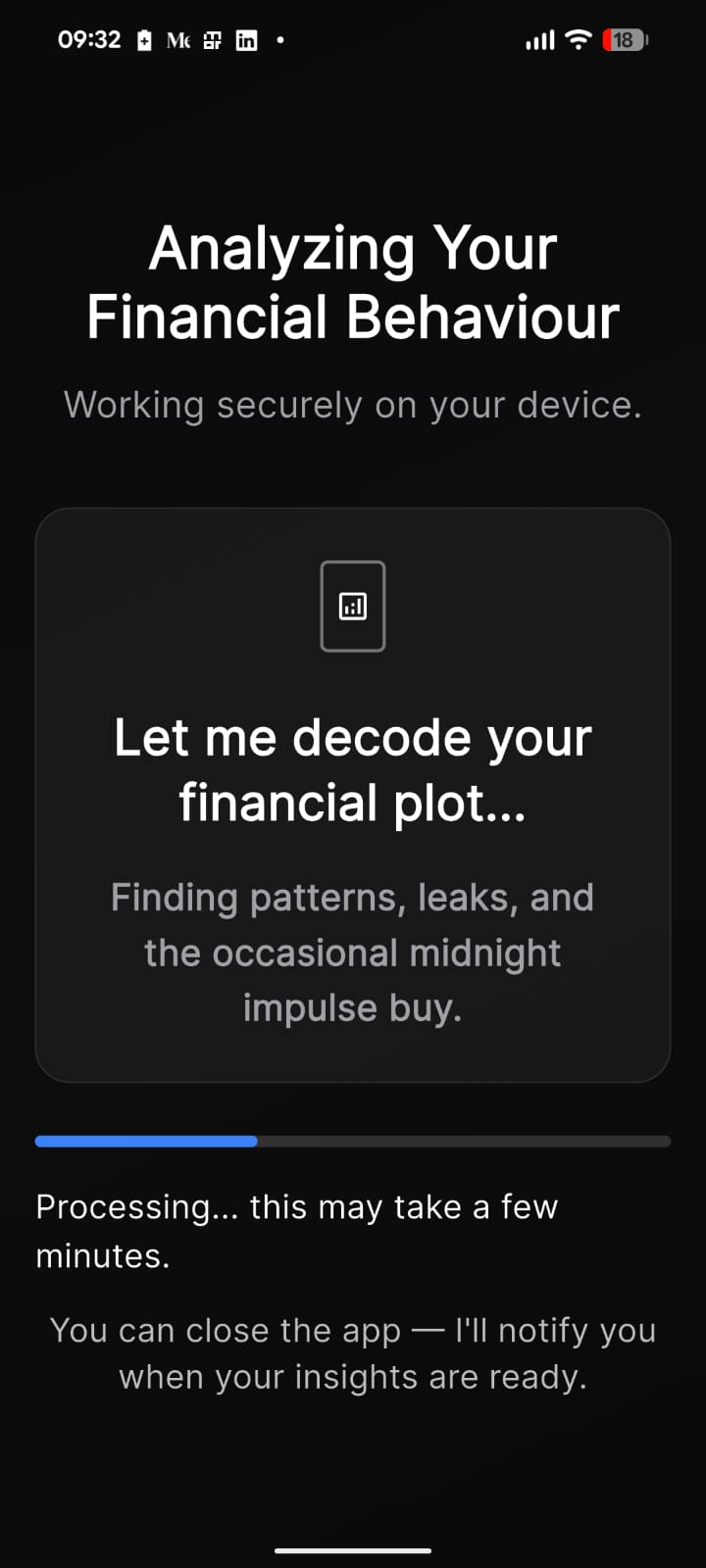
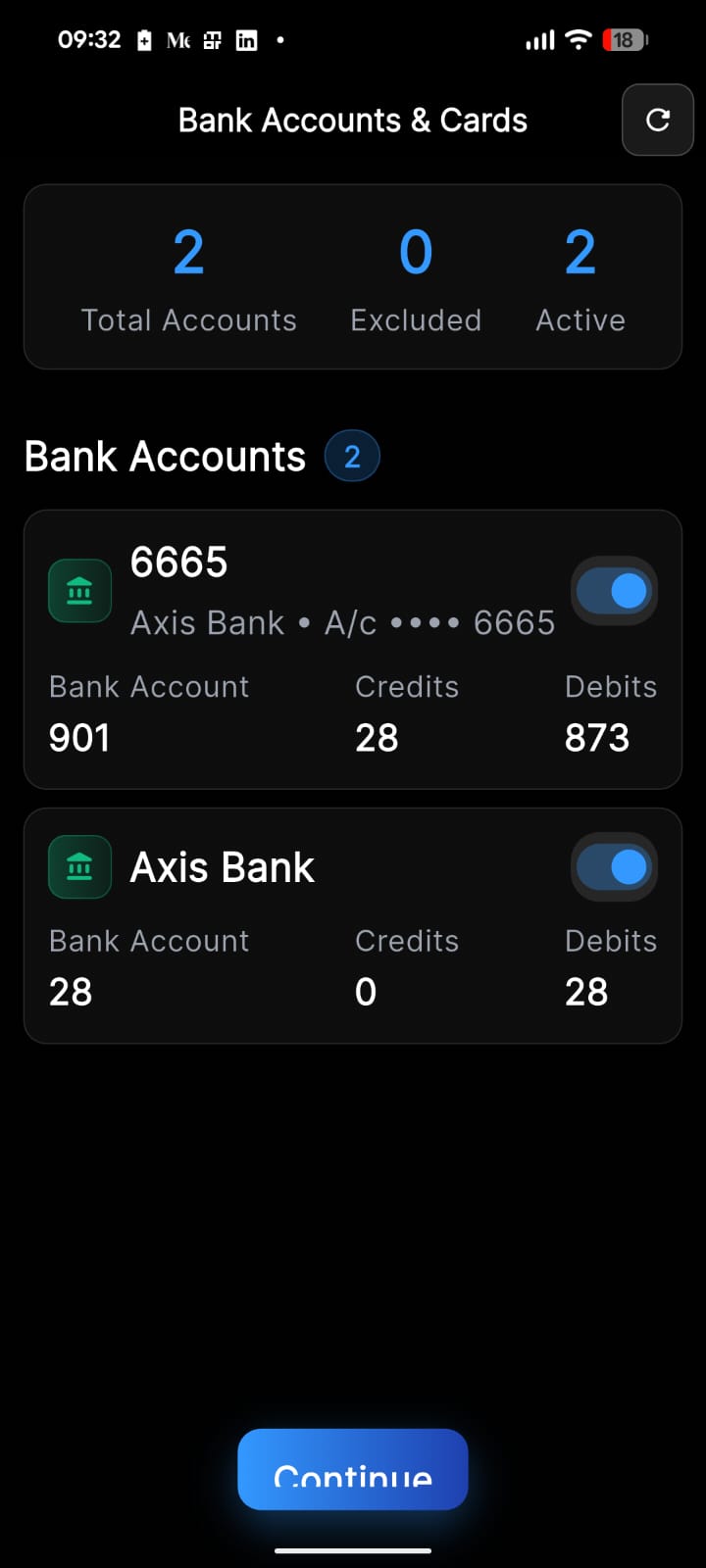
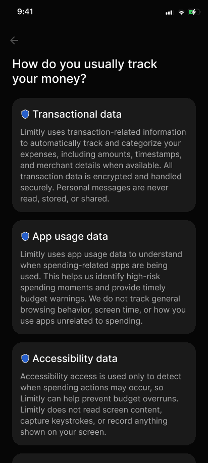
Using Claude we built a complete onboarding experience, focusing on clearer Value Propositions and personalization to build trust at early stages.
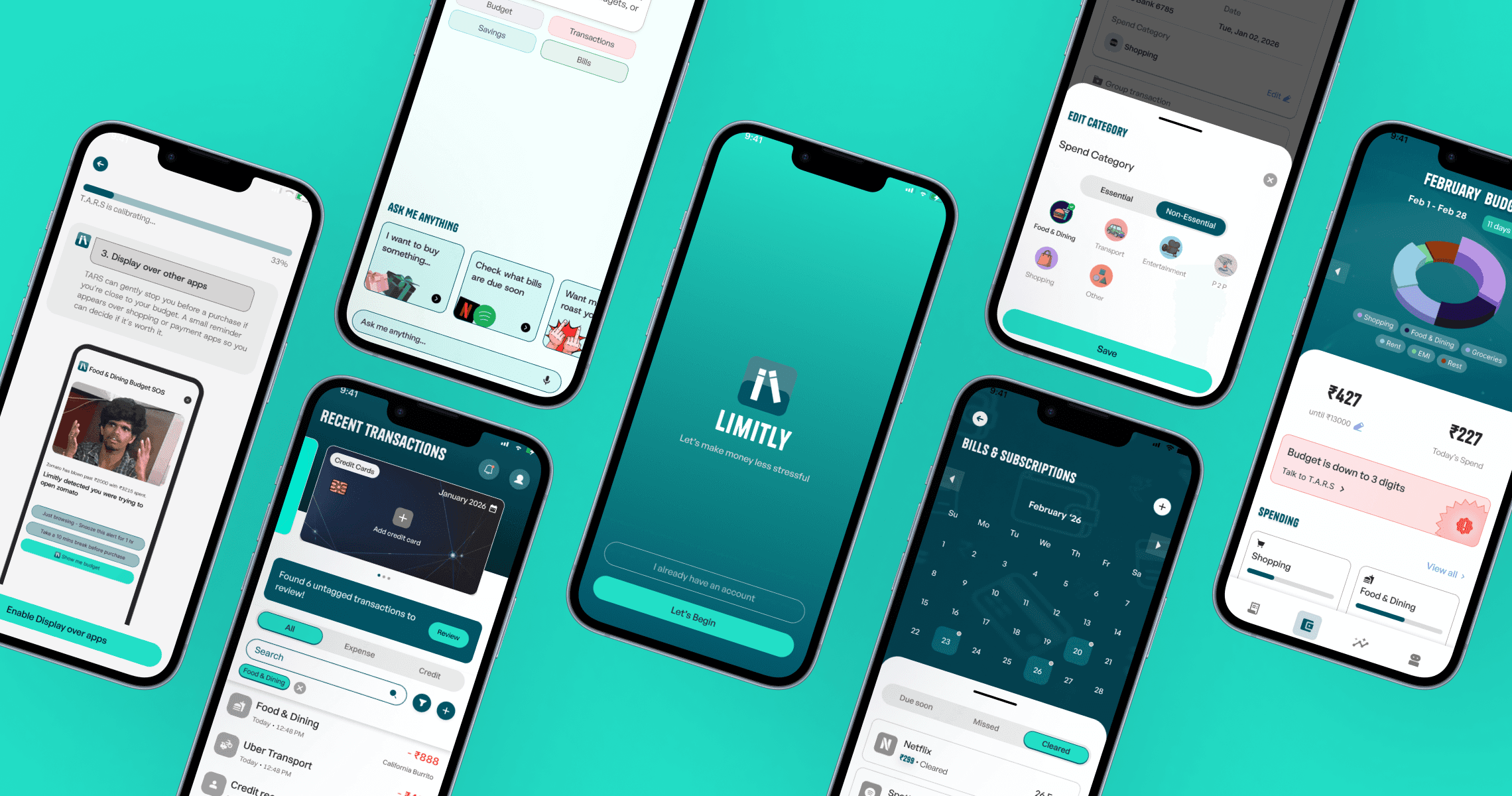
Onboarding user flow
Wireframes / Mid-fidelity screens


The first sprint
We then proceeded to update the landing pages for each of the following sections/features in the application.

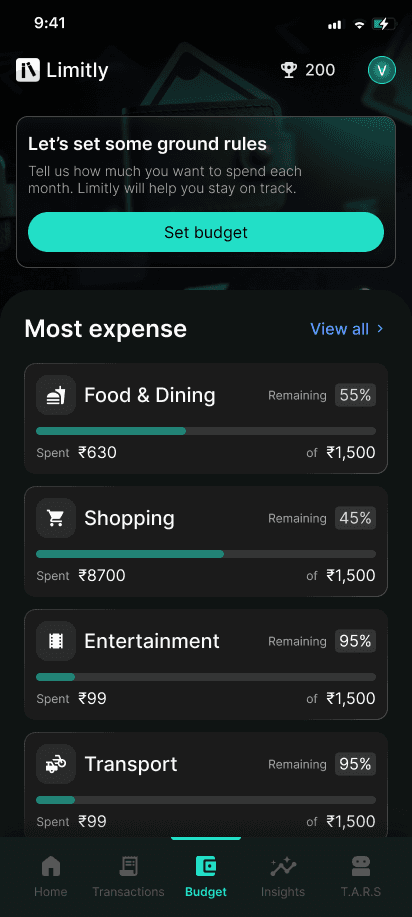


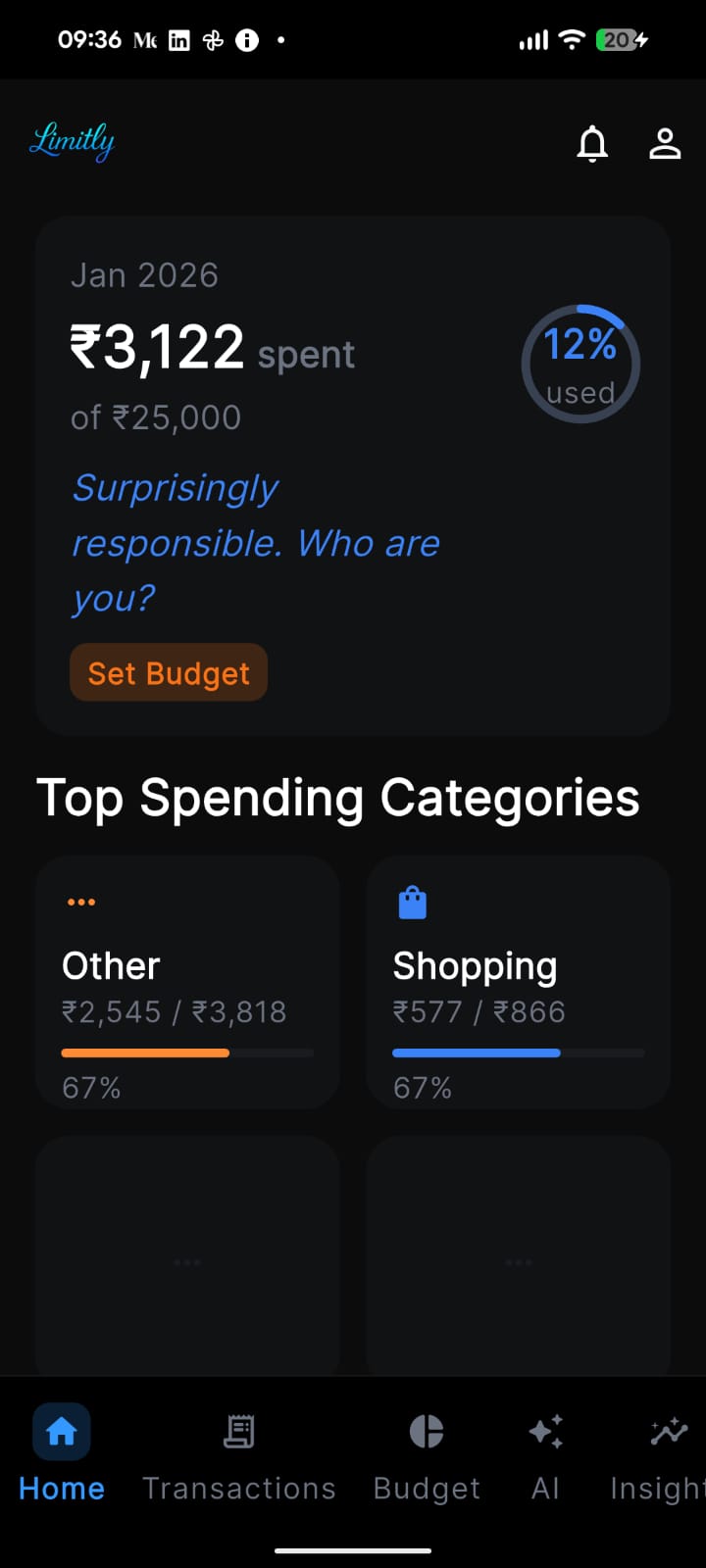
since the budget page did most of the heavy lifting we decided to scrap the idea of having a home section.

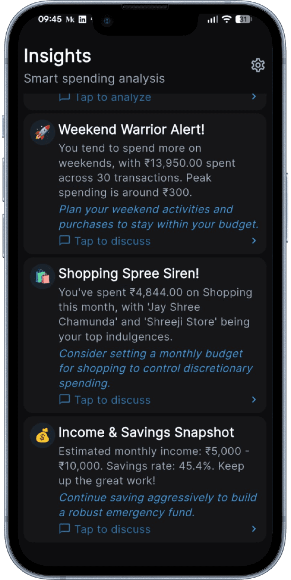
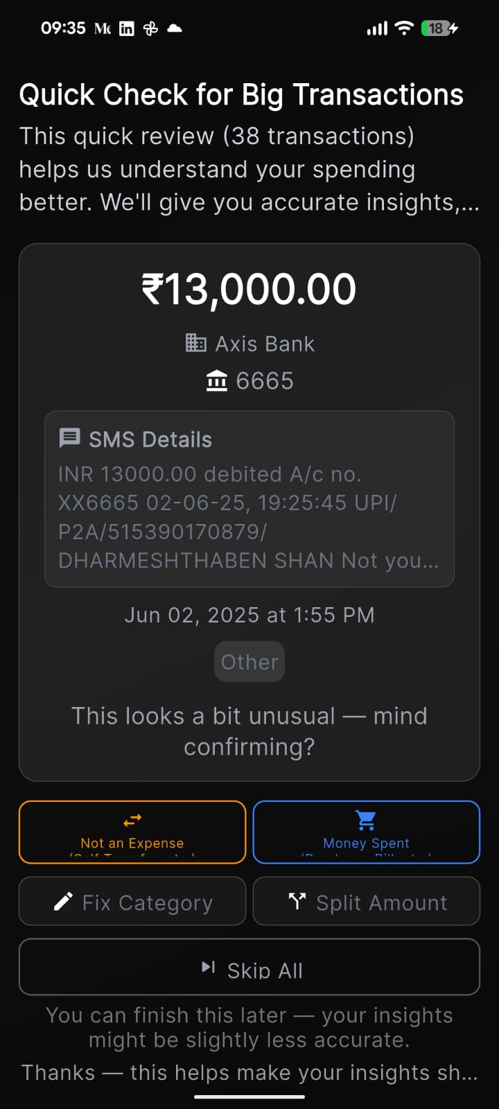
As for insights page which was filled with paragraphs worth of warnings or actionable insights, felt too overwhelming and it was easy to miss out on important stuff.

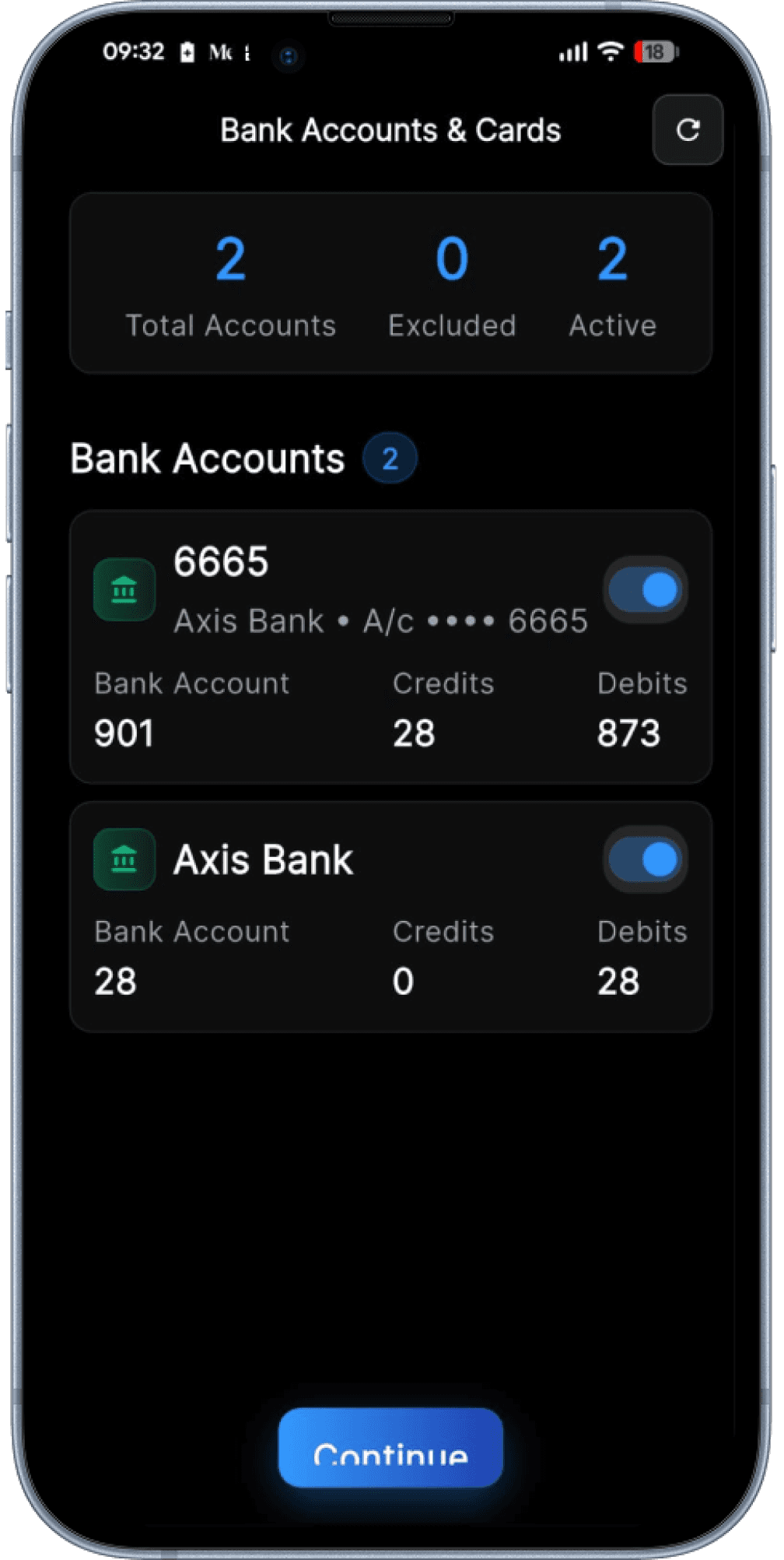
Other Key screens
Great, now lets test it
Results of user testing
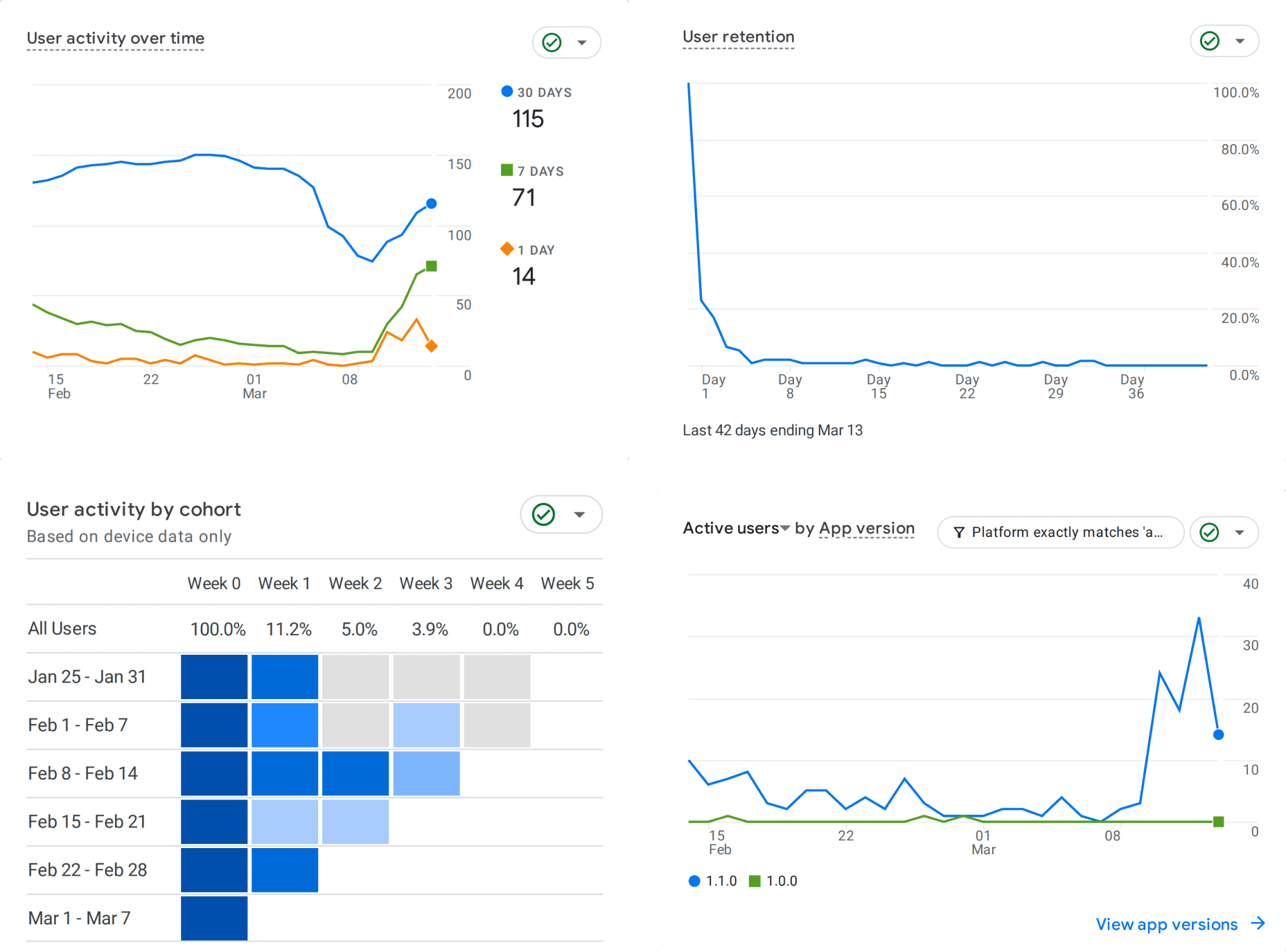
Most users were dropping off due to bug reports in the application, but that is expected at the initial stages.
However, it created an opportunity for the design team to address deeper product challenges related to the application’s information architecture and user journeys.
Lets Refine and Iterate
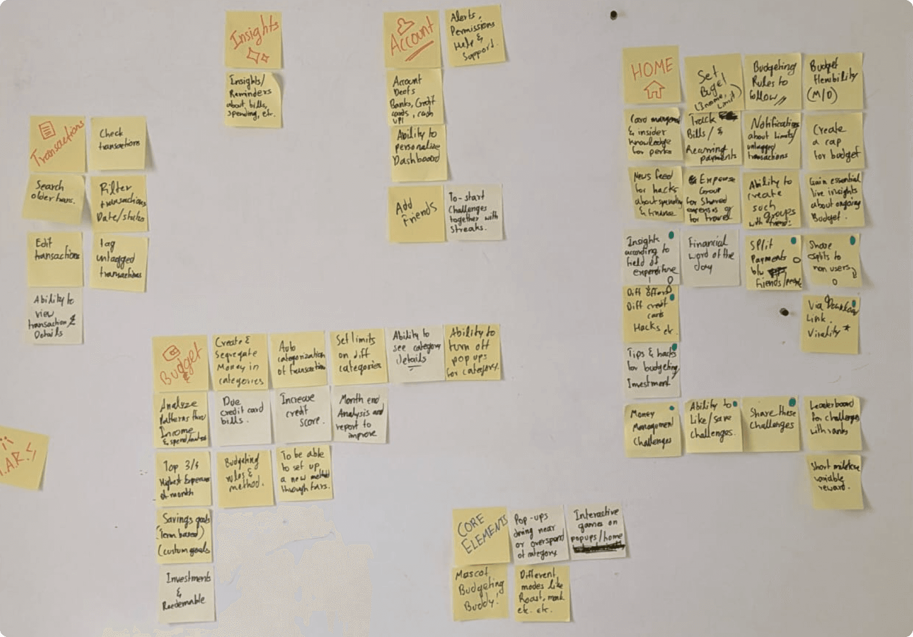
Card Sorting
This helped map limitly's overlapping features into distinct, navigable sections. This allowed users to find what they needed without friction.
Final Designs
Onboarding
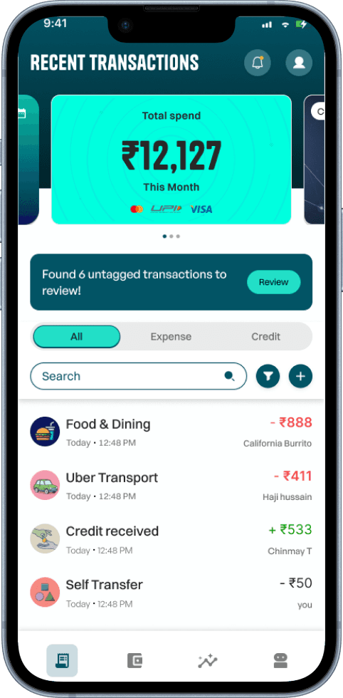
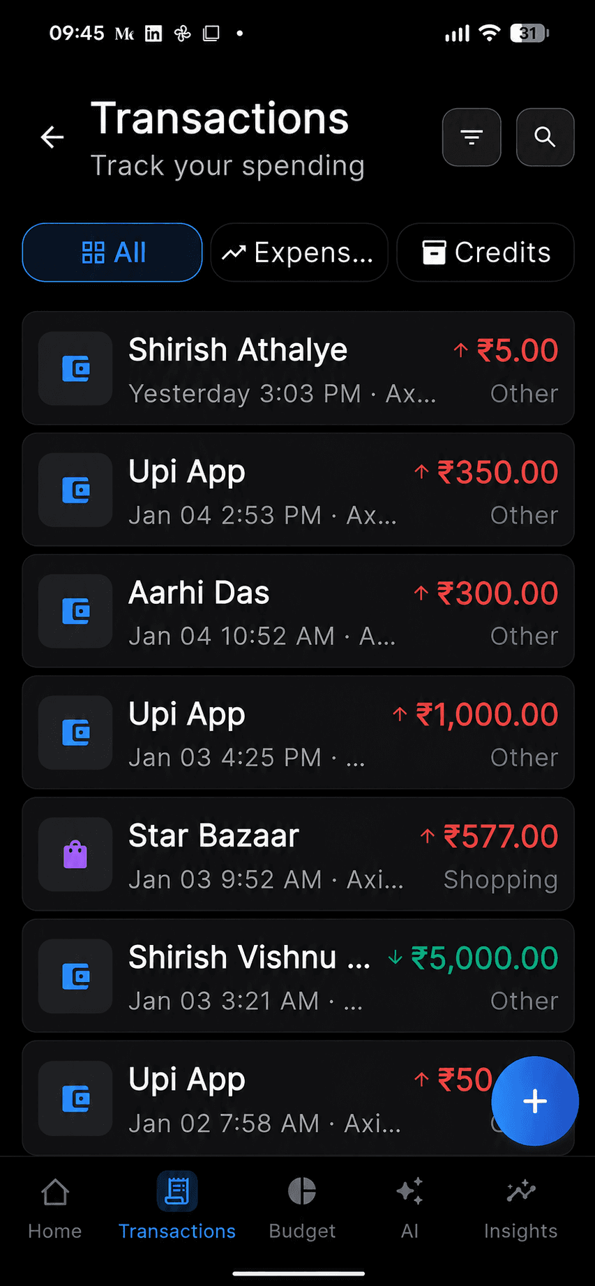
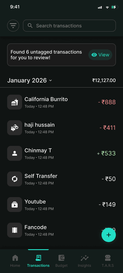
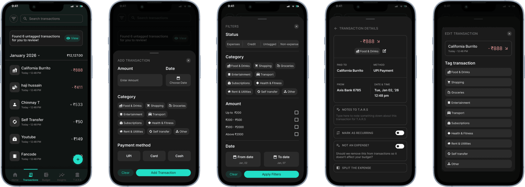
Recent transactions

Transaction review

Adding transaction
Transactions page
Recent transactions
Transaction review
Adding transaction
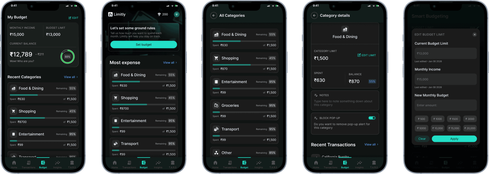
Budget page
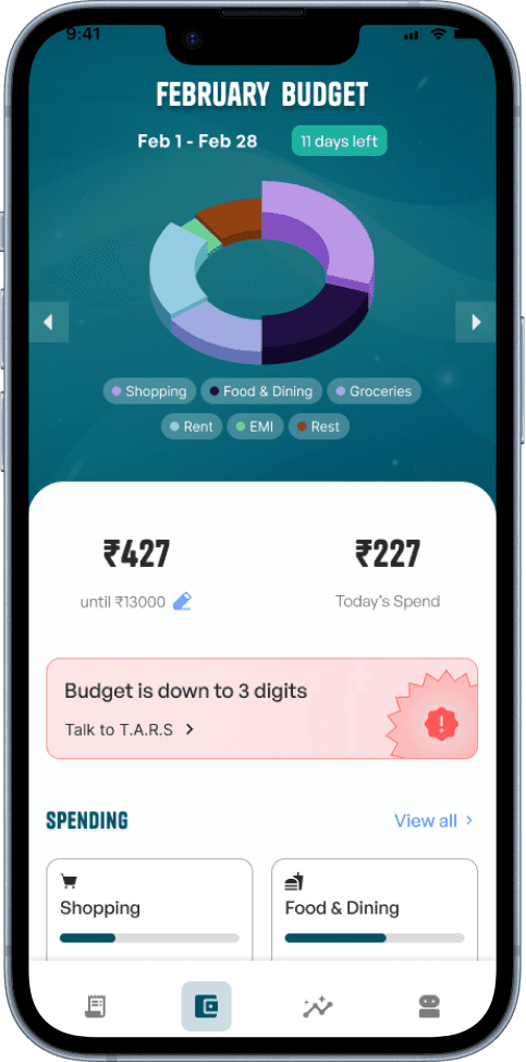
Monthly budget
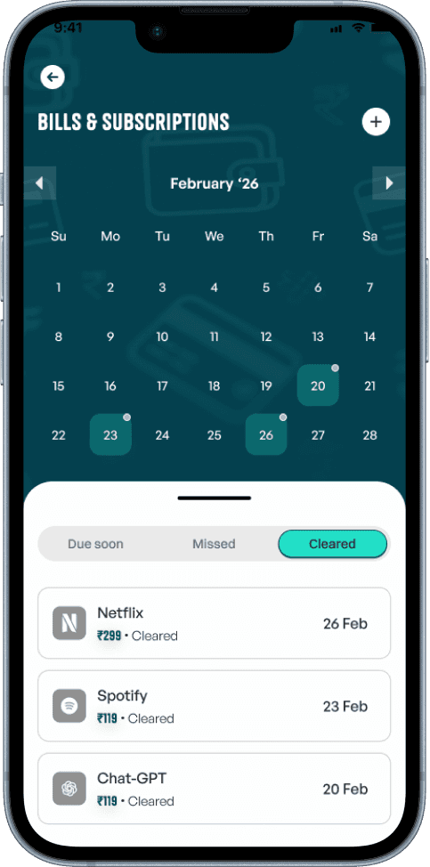
Bills & subscriptions

Spending categories
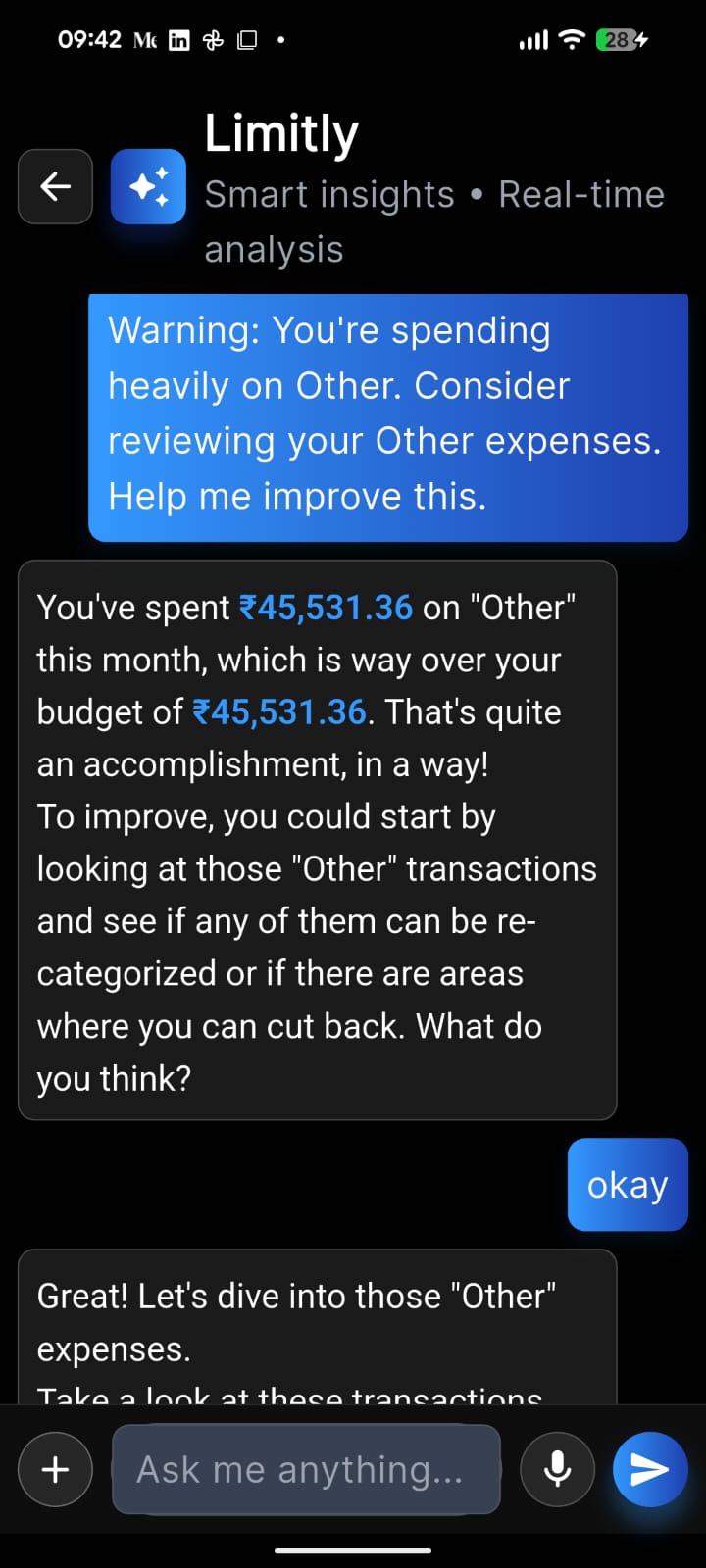
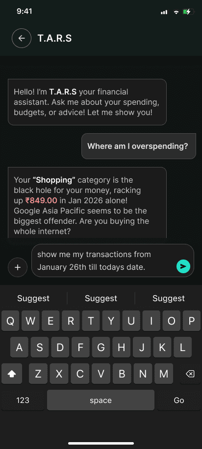
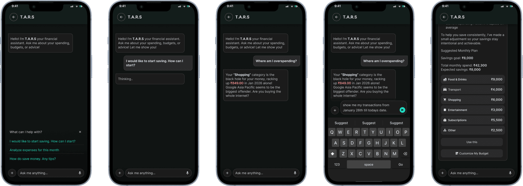
T.A.R.S
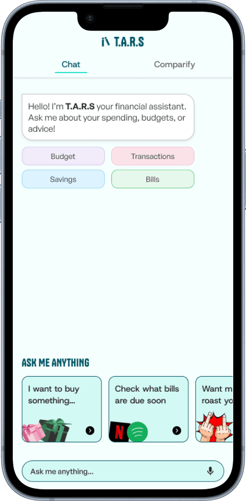
T.A.R.S
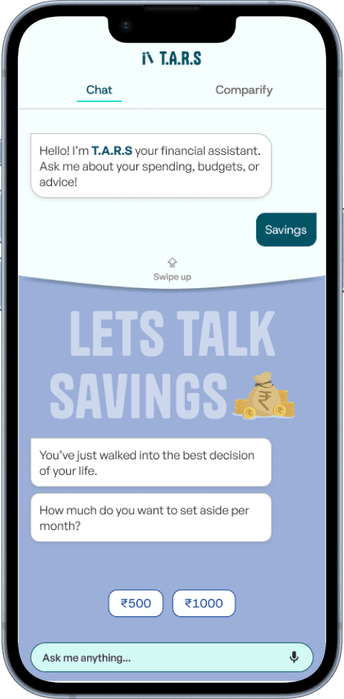
Savings section
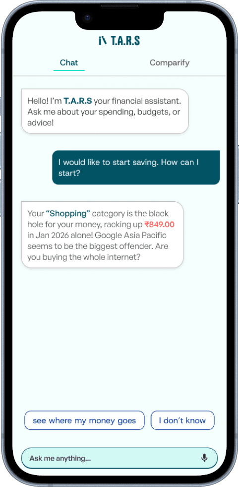
How T.A.R.S replies
Cool, so what's next?
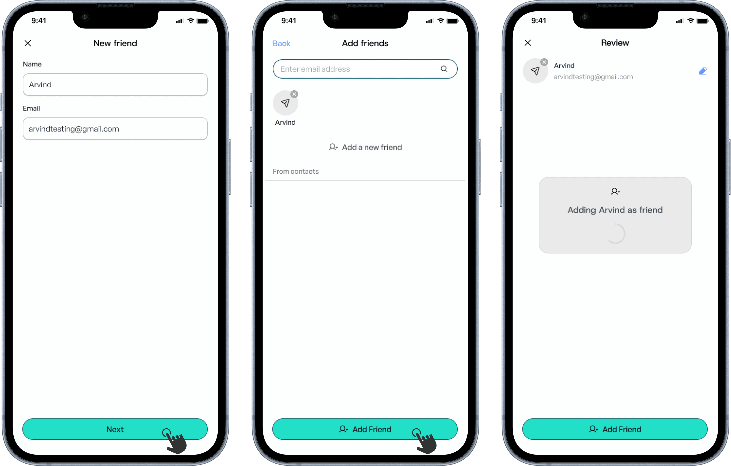
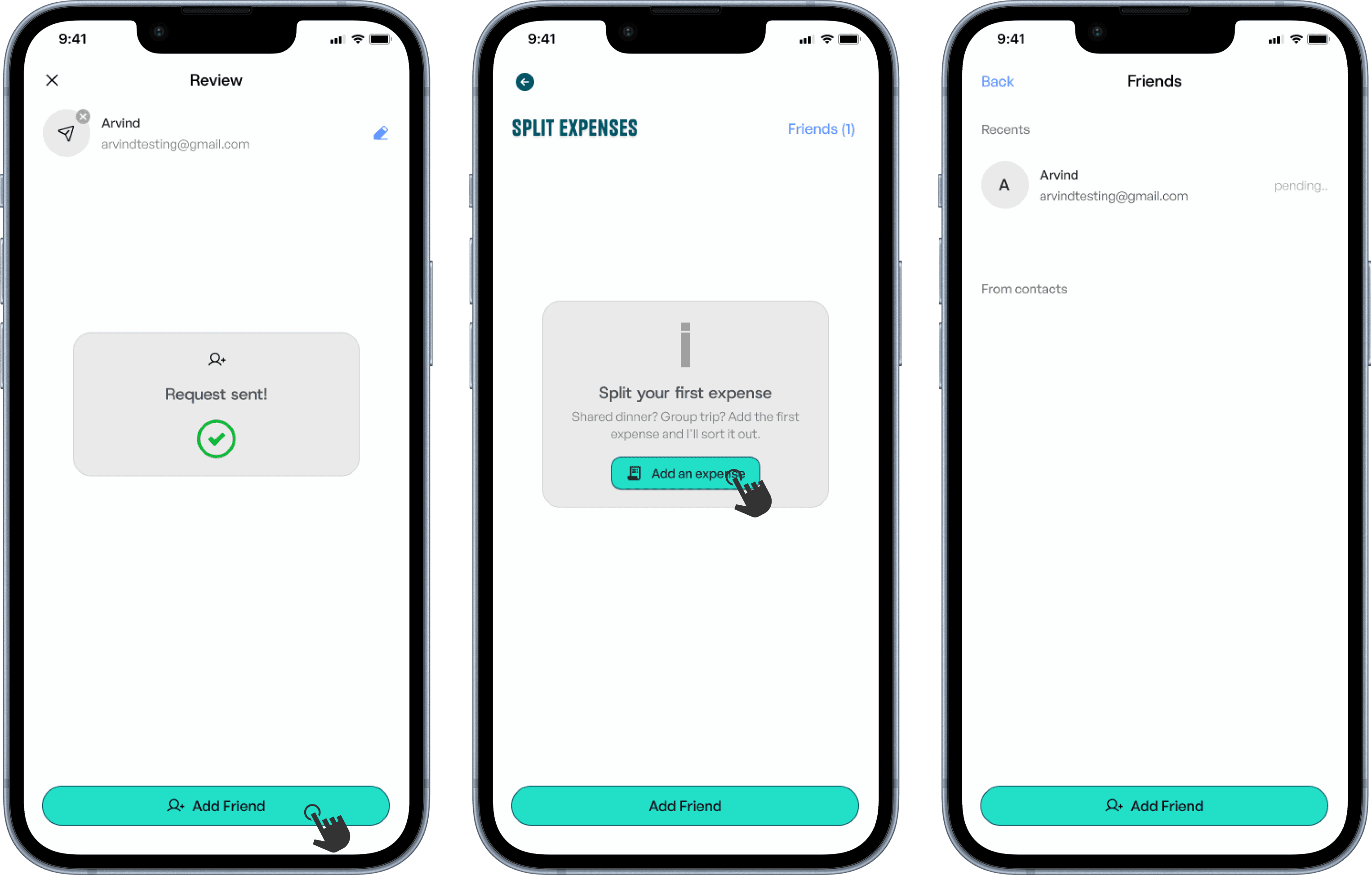
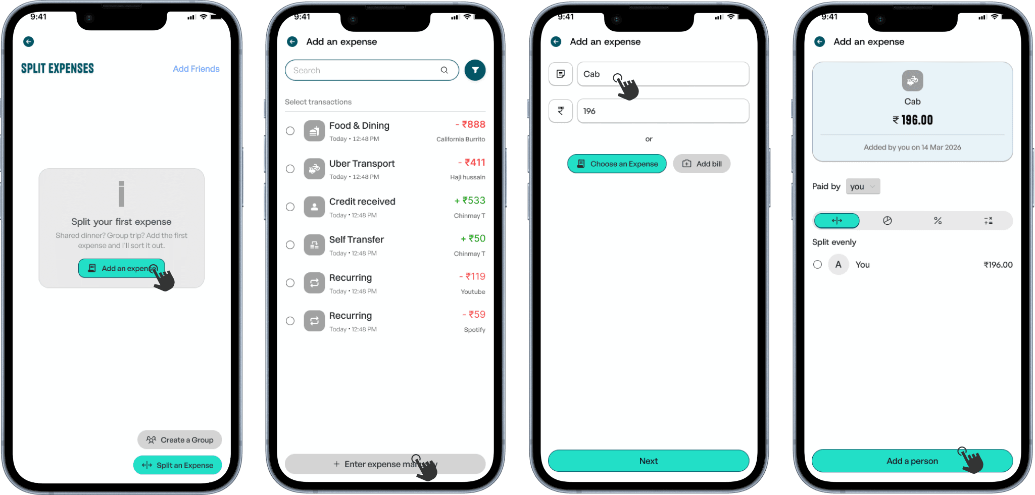
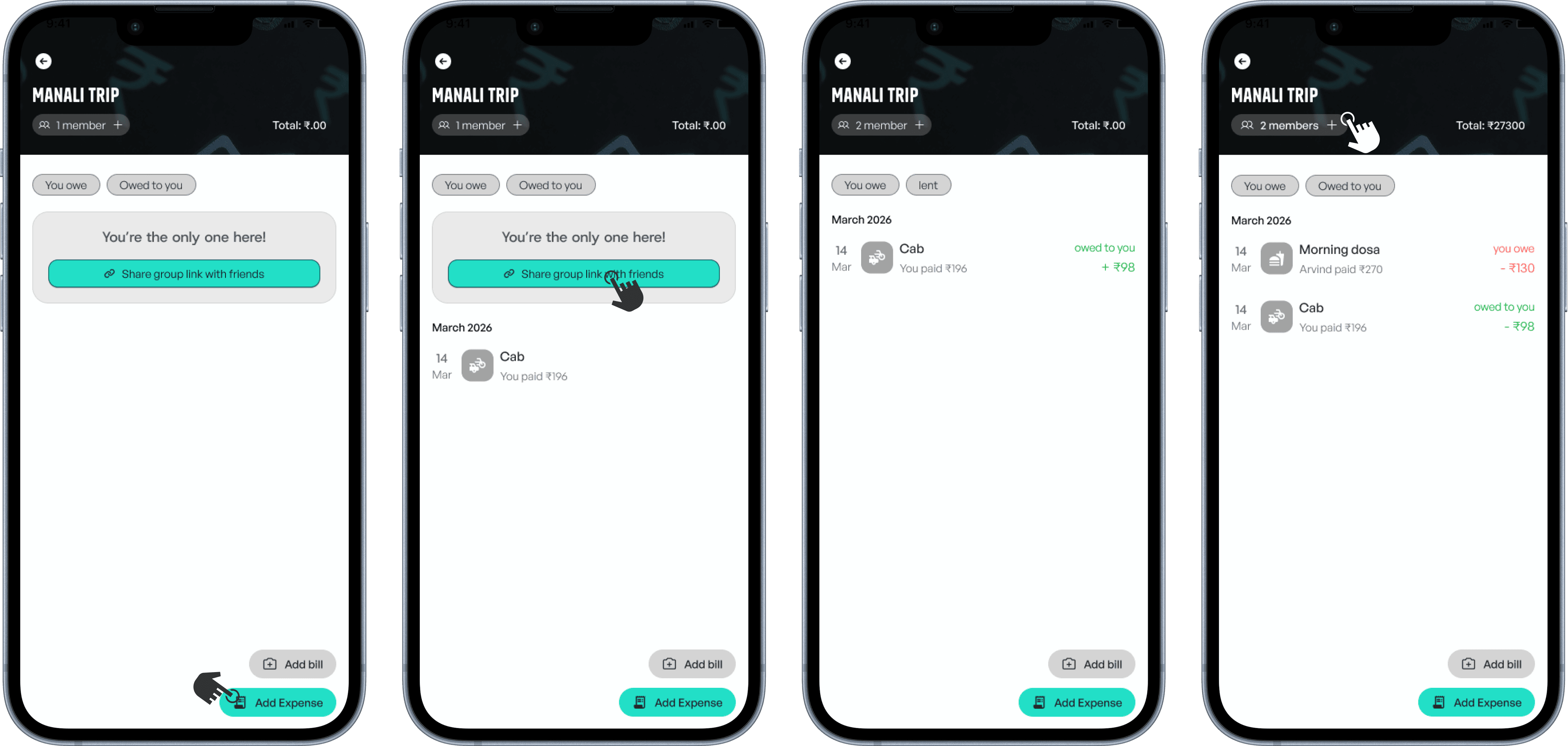
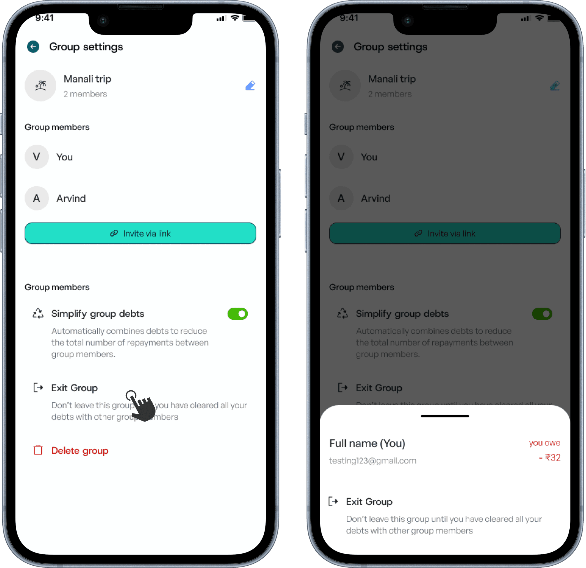
Payment split groups - Exploration
Add friends, split transactions, and automatically create groups. Or build groups from scratch to track shared expenses with multiple people. View balances, settle debts, and manage who owes whom—all in one place.
Adding a Friend

Splitting an expense

Creating a group

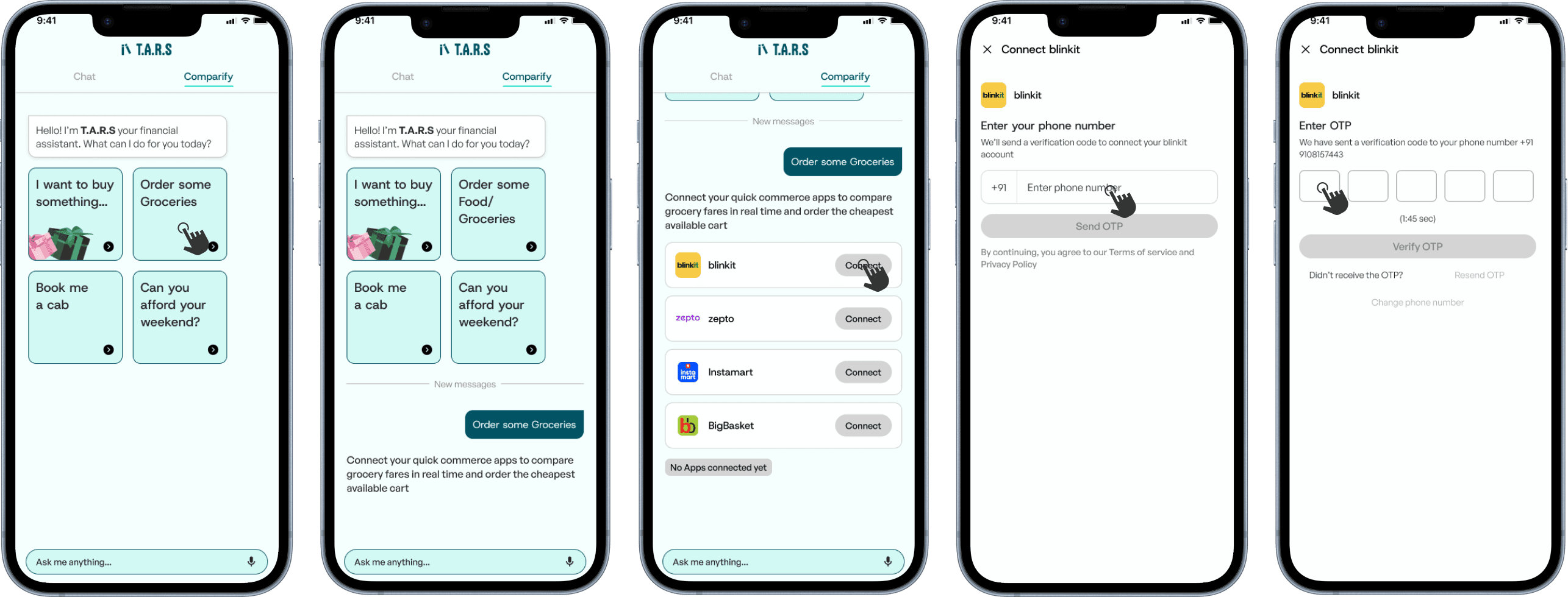
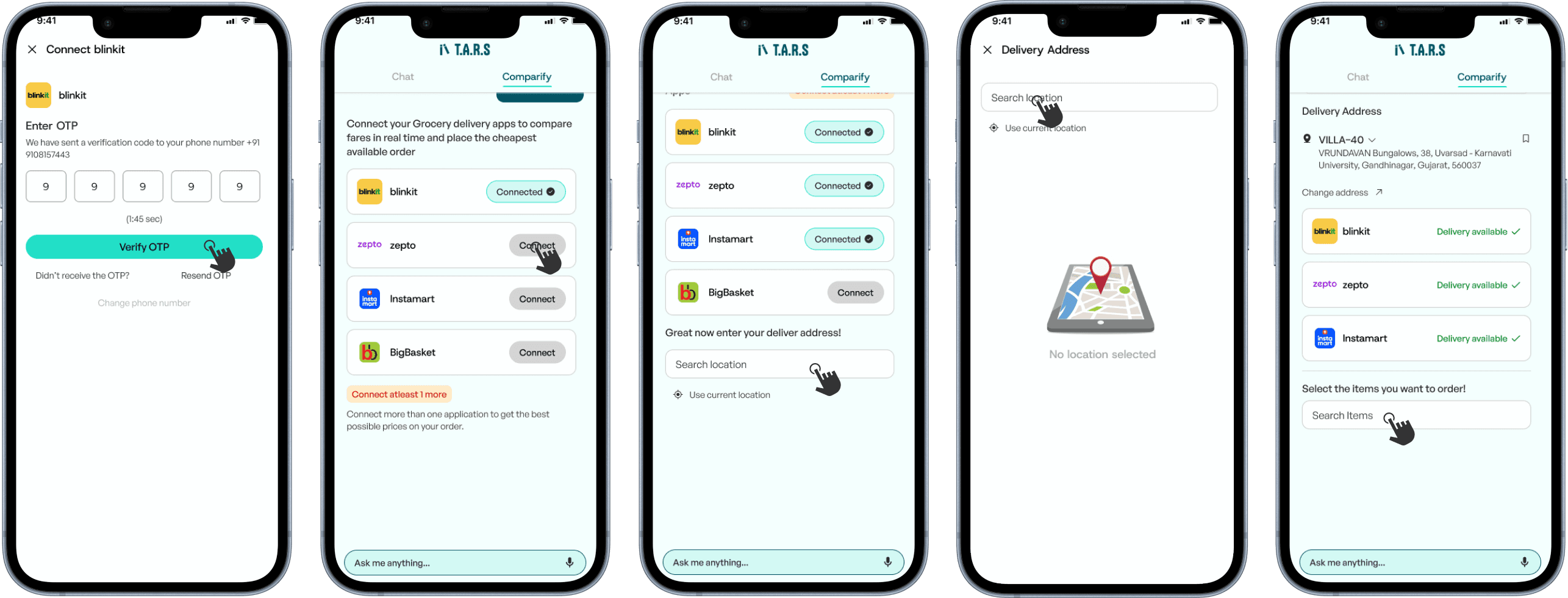
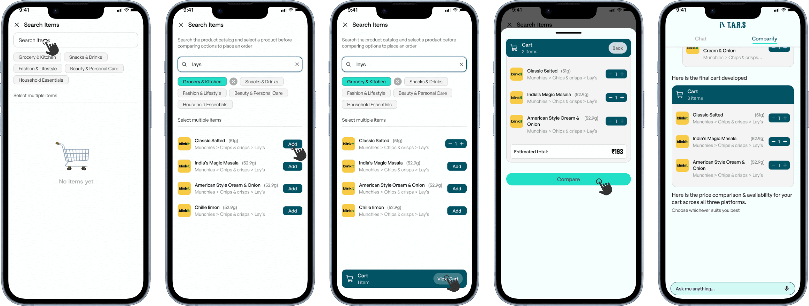
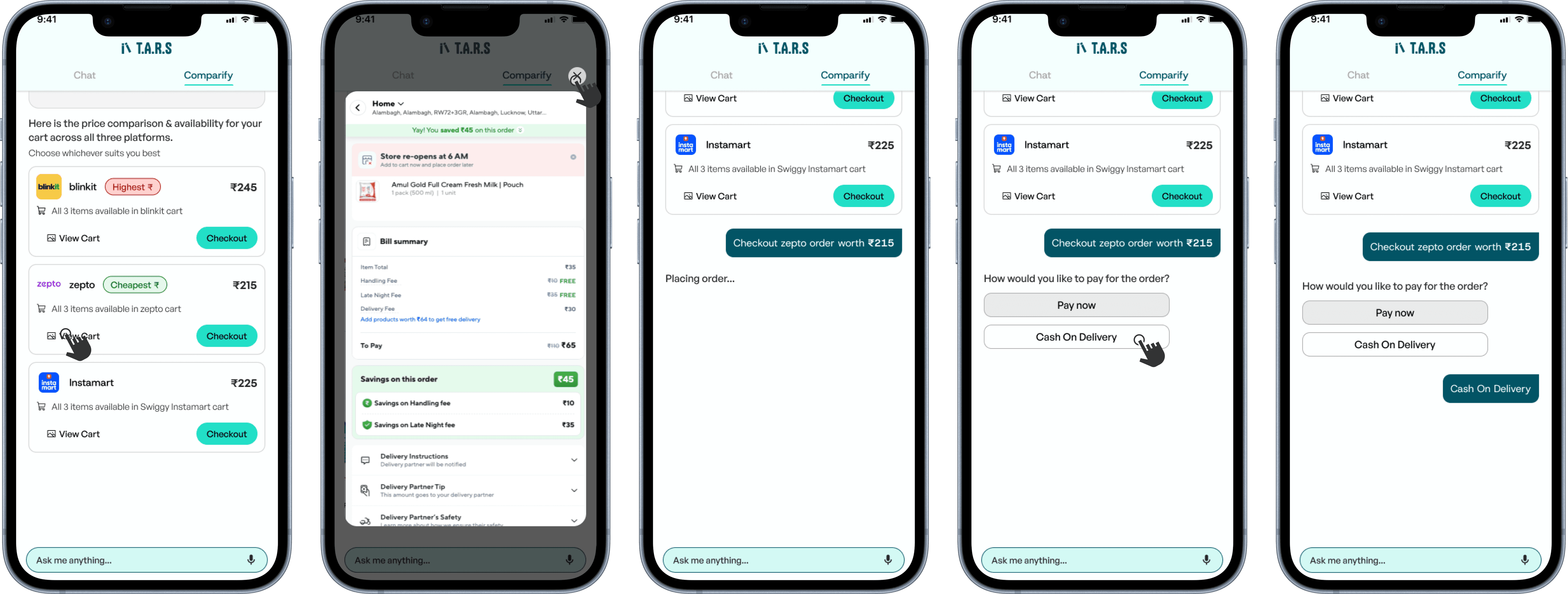
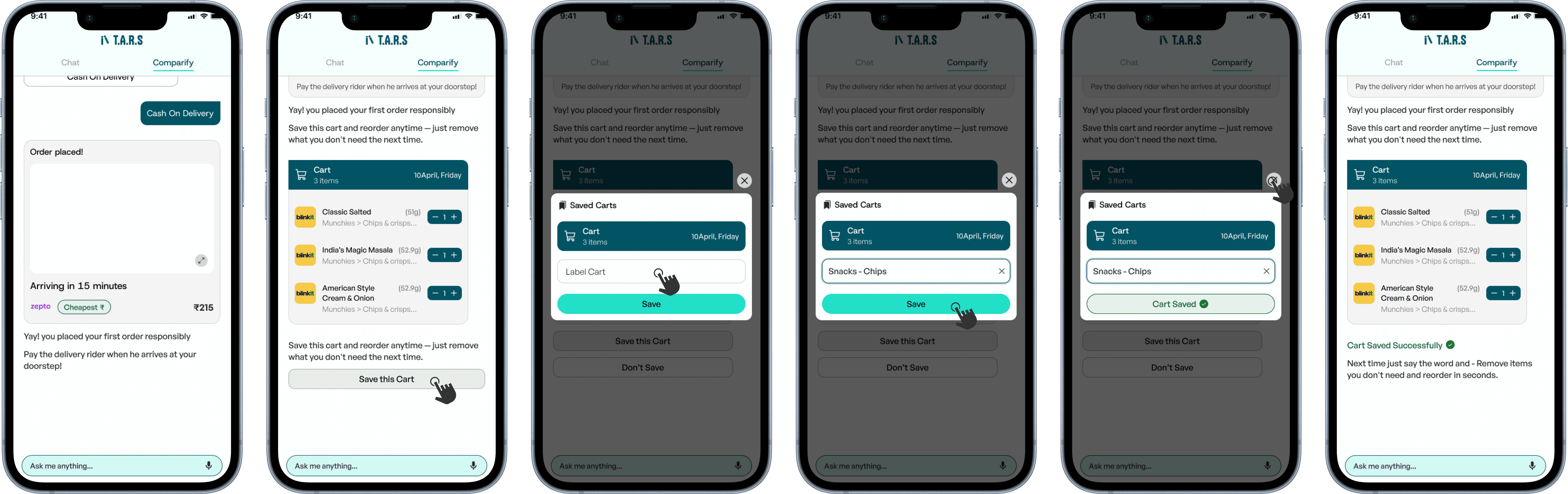
Agentic T.A.R.S - Exploration
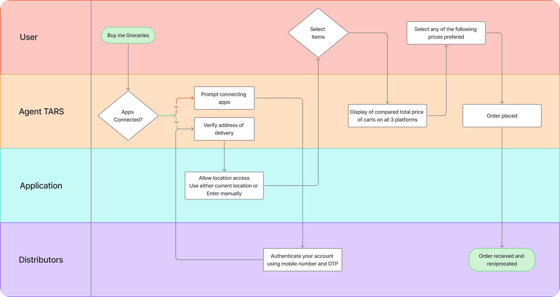
Agentic T.A.R.S
Key takeaways
Things Left Unexplored
Design System Exploration
Exploring “Pot” for Passive Growth
Gamifying Budgeting Experiences